Footprint.Pro-v3.7-EN [Elykia]Title: Footprint Pro System - Order Flow & Price Action
Footprint Pro is a comprehensive institutional-grade Order Flow suite designed to visualize the internal dynamics of a candle. It allows traders to see Bid x Ask volume, Delta, and Liquidity imbalances directly inside the bars, offering a "X-Ray" view of the market.
This tool is optimized for Scalping and Intraday trading, compatible with both Standard Timeframes and simulated Range Bars.
🔥 Key Features
1. Dual Calculation Modes
Timeframe Mode: Displays Footprints on standard candles (1m, 5m, etc.) with a live countdown.
Range Mode (Simulated): Calculates Range Bars based on volatility (Points/Ticks) rather than time. This filters out noise and highlights pure price movement.
Note: Includes a performance optimizer to limit historical calculation.
2. Advanced Visualization Styles
Standard Style: Classic box display with Bid x Ask or Total Volume numbers. Includes a Volume Heatmap that changes color intensity based on Delta strength.
Profile Style: Displays a volume profile histogram next to each candle to visualize the distribution of liquidity within the bar.
3. 🧠 Smart Assistant & Automated Setups
The script includes a real-time analysis engine that detects 5 high-probability Order Flow setups:
S1 - Rejection: Detects price reversal with strong wick rejection and Delta confirmation.
S2 - Exhaustion: Identifies a trend drying up (Volume drops significantly at highs/lows).
S3 - Absorption (Iceberg): Detects aggressive buying/selling that fails to move price (High Volume + Inverse Delta).
S4 - Trapped Traders (New): "Effort vs. Result." Detects high Delta participation but the candle closes in reverse (e.g., Doji or opposite color).
S5 - Stacked Imbalances (New): Identifies "Walls" of liquidity. Looks for 3 consecutive levels where Buy/Sell volume exceeds the imbalance ratio (default 300%).
4. Data & Analytics Dashboard
Fixed Data Ribbon: A ribbon at the bottom of the screen showing Volume, Delta, and Divergences for the last 50 candles.
Technical Dashboard: Displays current mode, Range size, and tick value.
Setups Table: An on-screen legend explaining active signals and their logic.
5. Order Flow Nuances
Delta Flip (Divergence): Highlights candles where Price and Delta disagree (e.g., Red Candle but Positive Delta), signaling a potential reversal or trap.
POC (Point of Control): auto-plots the highest volume node of the candle.
VWAP Session: Integrated anchor for confluence.
5. 🔥 Advanced Histogram & Visualization
The core of this system is its ability to break down a candle into granular price levels (bins). It offers a rich visual representation of market intent:
Dynamic Histogram:
Standard Style: Displays volume blocks inside the candle.
Profile Style: Projects a Volume Profile histogram alongside the candle to instantly identify high-volume nodes (HVN) and low-volume nodes (LVN).
Delta & Volume Data:
You can choose to display Bid x Ask interactions or Total Volume per level.
Delta Coloring: Automatically colors bars based on the net difference between buyers and sellers.
Smart Heatmap (Visual Filtering):
The script uses a dynamic Heatmap System.
Weak Levels: Displayed with high transparency (faint colors), filtering out noise.
Strong Levels: Displayed in solid, bright colors (Red/Green) when volume/delta exceeds critical thresholds. This draws your eye immediately to where the real money is exchanging hands.
🛠️ Installation & Best Setup (Critical)
For the most accurate volume filtering and "Tick-Perfect" precision, this tool is designed to work on the lowest possible timeframe.
1. Set Chart to 1-Second Timeframe:
Ideally, position your TradingView chart on the 1-second (1s) timeframe.
Why? The script aggregates these micro-movements to reconstruct higher timeframe candles with minimal data loss and maximum volume precision.
2. Clean the Chart:
Go to Chart Settings (Symbol).
Uncheck "Body", "Borders", and "Wick".
Why? The script draws its own custom candles. Hiding the native chart prevents visual clutter.
3. Configure the Footprint:
Open the Indicator Settings.
Timeframe Footprint: Select your desired trading timeframe (e.g., 1 minutes ... 15 minutes, ).
The script will now calculate and draw a perfect 5-minute Footprint candle using the high-precision 1-second data feed.
🚀 Optimization
Footprint charts are calculation-heavy. This script includes a Performance Optimization group:
Limits the number of drawn boxes.
Dynamic buffer calculation.
"Smart Load" allows you to view historical data without freezing the browser.
Recommended (Premium): To optimize the tool and precisely separate Buy/Sell, using second-based charts (1s, 5s) via a TradingView Premium subscription is highly recommended.
Disclaimer: Order Flow analysis requires practice. This tool provides data visualization and does not constitute financial advice.
Cerca negli script per "Buy sell"

VB-MainLiteVB-MainLite – v1.0 Initial Release
Overview
VB-MainLite is a consolidated market-structure and execution framework designed to streamline decision-making into a single chart-level view. The script combines multi-timeframe trend, volatility, volume, and liquidity signals into one cohesive visual layer, reducing indicator clutter while preserving depth of information for active traders.
Core Architecture
Trend Backbone – EMA 200
Dedicated EMA 200 acts as the primary trend filter and higher-timeframe bias reference.
Serves as the “spine” of the system for contextualizing all secondary signals (swings, reversals, volume events, etc.).
Custom MA Suite (Envelope Ready)
Four configurable moving averages with flexible source, length, and smoothing.
Default configuration (preset idea: “8/89 Envelope”):
MA #1: EMA 8 on high
MA #2: EMA 8 on low
MA #3: EMA 89 on high
MA #4: EMA 89 on low
All four are disabled by default to keep the chart minimal. Users can toggle them on from the Custom MAs group for envelope or cloud-style configurations.
Nadaraya–Watson Smoother (Swing Framework)
Gaussian-kernel Nadaraya–Watson regression applied to price (hl2) to build a smooth synthetic curve.
Two layers of functionality:
Swing labels (▲ / ▼) at inflection points in the smoothed curve.
Optional curve line that visually tracks the turning structure over the last ~500 bars.
Designed to surface early swing potential before standard MAs react.
Hull Moving Average (Trend Overlay)
Optional Hull MA (HMA) for faster trend visualization.
Color-coded by slope (buy/sell bias).
Default: off to prevent overloading the chart; can be enabled under Hull MA settings.
Momentum, Exhaustion & Pattern Engine
CCI-Based Bar Coloring
CCI applied to close with configurable thresholds.
Overbought / oversold CCI zones map directly into candle coloring to visually highlight short-term momentum extremes.
RSI Top / Bottom Exhaustion Finder
RSI logic applied separately to high-driven (tops) and low-driven (bottoms) sequences.
Plots:
Top arrows where high-side RSI stretches into high-risk territory.
Bottom arrows where low-side RSI indicates exhaustion on the downside.
Useful as confluence around the Nadaraya swing turns and EMA 200 regime.
Engulfing + MA Trend Engine (“Fat Bull / Fat Bear”)
Detects bullish and bearish engulfing patterns, then combines them with MA trend cross logic.
Only when both pattern and MA regime align does the engine flag:
Fat Bull (Engulf + MA aligned long)
Fat Bear (Engulf + MA aligned short)
Candles are marked via conditional barcolor to highlight strong, structured shifts in control.
Fat Finger Detection (Wick Spikes / Stop Runs)
Identifies abnormal wick extensions relative to the prior bar’s body range with configurable tolerance.
Supports detection of potential liquidity grabs, stop runs, or “excess” that may precede reversals or mean-reversion behavior.
Volume & Liquidity Intelligence
Bull Snort (Aggressive Buy Spikes)
Flags events where:
Volume is significantly above the 50-period average, and
Price closes in the upper portion of the bar and above prior close.
Plots a labeled marker below the bar to indicate aggressive upside initiative by buyers.
Pocket Pivots (Accumulation Flags)
Compares current volume vs prior 10 sessions with a filter on prior “up” days.
Highlights pocket pivot days where current green candle volume outclasses recent down-day volumes, suggesting stealth accumulation.
Delta Volume Core (Directional Volume by Price)
Internal volume-by-price style engine over a user-defined lookback.
Splits volume into up-close and down-close buckets across dynamic price bins.
Feeds into S&R and ICT zone logic to quantify where buying vs selling pressure built up.
Structural Context: S&R and ICT Zones
S&R Power Channel
Computes local high/low band over a configurable lookback window.
Renders:
Upper and lower S&R channel lines.
Shaded support / resistance zones using boxes.
Adds Buy Power / Sell Power metrics based on the ratio of up vs down bars inside the window, displayed directly in the zone overlays.
Drops ◈ markers where price interacts dynamically with the top or bottom band, highlighting reaction points.
ICT-Style Premium / Discount & Macro Zones
Two tiered structures:
Local Premium / Discount zones over a shorter SR window.
Macro Premium / Discount zones over a longer macro window.
Each zone:
Uses underlying directional volume to annotate accumulation vs distribution bias.
Provides Delta Volume Bias shading in the mid-band region, visually encoding whether local power flows are net-buying or net-selling.
Enables traders to quickly see whether current trade location is in a local/macro discount or premium context while still respecting volume profile.
Positioning Intelligence: PCD (Stocks)
Position Cost Distribution (PCD) – Stocks Only
Available for stock symbols on intraday up to daily timeframe (≤ 1D).
Uses:
TOTAL_SHARES_OUTSTANDING fundamentals,
Daily OHLCV snapshot, and
A bucketed distribution engine
to approximate cost basis distribution across price.
Outputs:
Horizontal “PCD bars” to the right of current price, density-scaled by estimated share concentration.
Color-coding by profitability relative to current price (profitable vs unprofitable positions).
Labels for:
Current price
Average cost
Profit ratio (share % below current price)
90% cost range
70% cost range
Range overlap as a measure of clustering / concentration.
Multi-Timeframe Trend: Two-Pole Gaussian Dashboard
Two-Pole Gaussian Filter (Line + Cloud)
Smooths a user-selected source (default: close) using a two-pole Gaussian filter with tunable alpha.
Plots:
A thin Gaussian trend line, and
A thick Gaussian “cloud” line with transparency, colored by slope vs past (offsetG).
Functions as a responsive trend backbone that is more sensitive than EMA 200 but less noisy than raw price.
Multi-Timeframe Gaussian Dashboard
Evaluates Gaussian trend direction across up to six timeframes (e.g., 1H / 2H / 4H / Daily / Weekly).
Renders a compact bottom-right table:
Header: symbol + overall bias arrow (up / down) based on average trend alignment.
Row of colored cells per timeframe (green for uptrend, magenta for downtrend) with human-readable TF labels (e.g., “60M”, “4H”, “1D”).
Gives an immediate read on whether intraday, swing, and higher-timeframe flows are aligned or fragmented.
Default Configuration & Usage Guidance
Default state after adding the script:
Enabled by default:
EMA 200 trend backbone
Nadaraya–Watson swing labels and curve
CCI bar coloring
RSI top/bottom arrows
Fat Bull / Fat Bear engine
Bull Snort & Pocket Pivots
S&R Power Channel
ICT Local + Macro zones
Two-pole Gaussian line + cloud + dashboard
PCD engine for stocks (auto-active where data is available)
Disabled by default (opt-in):
Custom MA suite (4x MAs, preset as EMA 8/8/89/89)
Hull MA overlay
How traders can use VB-MainLite in practice:
Use EMA 200 + Gaussian dashboard to define top-down directional bias and avoid trading directly against multi-TF trend.
Use Nadaraya swing labels, RSI exhaustion arrows, and CCI bar colors to time entries within that higher-timeframe bias.
Use Fat Bull / Fat Bear events as structured confirmation that both pattern and MA regime have flipped in the same direction.
Use Bull Snort, Pocket Pivots, and S&R / ICT zones to align execution with liquidity, volume, and location (premium vs discount).
On stocks, use PCD as a positioning map to understand trapped supply, support zones near crowded cost basis, and where profit-taking is likely.

Volume Trabar Rank PRO🔑 Key Concept
The indicator uses a rank-based system that counts the number of timeframe periods (lengths) where price has exceeded standard deviation thresholds. The higher the absolute rank value, the more extreme the market condition — indicating stronger potential reversal zones.
⚙️ How The Indicator Works
The indicator operates on a unique multi-length Bollinger Band analysis system:
📏 Multiple Length Analysis
📊 Rank Calculation
Counts how many bands the price has broken through to generate a rank value from -18 to +18
🎨 Visual Coding
Color-coded histogram and threshold lines for quick visual interpretation
Ranking System Explained :
Rank Value Signal Strength Typical Action
+8 to +18 Very Strong Consider Selling / Taking Profit
+7 Strong Watch for reversal signals
+4 to +6 Moderate Caution for new longs
+1 to +3 Weak Monitor market conditions
0 Neutral No extreme condition
-1 to -3 Weak Monitor market conditions
-4 to -6 Moderate Look for entry opportunities
-7 Strong Strong buy signal
-8 to -18 Very Strong High probability buy zone
Advanced Features
✅Filter #1: Volume Weighting
✅Filter #2: Outlier Filtering (IQR)
✅Filter #3: Anti-Repaint Logic
⏰ Multi-Timeframe Analysis
The indicator can simultaneously monitor up to 4 different timeframes (default: 1m, 5m, 15m, 30m), allowing traders to:
Identify confluence zones where multiple timeframes show the same signal
Spot divergences between timeframes for better timing
Generate "READY" signals when all MTF conditions align
🎯 MTF Ready Signal
READY BUY: Triggers when MTF #1, #2, and #3 all show oversold ranks ≤ -5
READY SELL: Triggers when MTF #1, #2, and #3 all show overbought ranks ≥ +5
These signals indicate strong multi-timeframe alignment, providing high-probability trading opportunities.
You can see here :
🛠️ How This Indicator Was Created
Accuracy Improvements (v3.0)
Volume Weighting: Replaced SMA with VWMA for better accuracy
Outlier Filtering: Added IQR-based filtering to remove false signals from price spikes
✨ Key Advantages
🚫 No Repainting
Anti-repaint logic ensures signals don't disappear or change after bar closure, providing reliable backtesting and live trading signals.
📊 Multi-Timeframe
Simultaneously monitor up to 4 timeframes, identifying confluence and divergence for better timing and higher probability trades.
🎯 Volume-Weighted
Uses actual volume data to weight calculations, making signals more representative of true market sentiment and participation.
🔬 Outlier Filtered
IQR-based filtering removes false signals from flash crashes, spikes, and other anomalous price action that doesn't represent real conditions.
⚡ Performance Optimized
Carefully tuned to balance accuracy with speed. Default settings optimize for the top 10% extreme conditions without lag.
🎨 Highly Customizable
Over 30 input parameters allow complete customization of lengths, thresholds, colors, and display options to match your trading style.
I just also add :
5M SCALPING OPTIMAL SETTINGS
Alert 🔥 Extreme Signal (Buy/Sell) - Priority HIGH and ⭐ Mid-Term Signal (Buy/Sell) - Priority NORMAL
MTF Blending Options ( 8 Blending Modes )
Rank Occurrences Table.
Bull and Bear divergence
-------
To get access to this script you have to be a member, or DM on TradingView.

RT-Machine Learning Reversion BandsMachine Learning Reversion Bands is a support and resistance tool designed to highlight where trends have historically reverted and where price is pushing into unusually extreme territory. It plots two sets of bands around price so traders can see both standard reversion zones and more extreme, machine learning levels that adapt and learn from the chart over time.
Introduction
The Machine Learning Reversion Bands tool utilizes an algorithm that learns from the chart’s full visible history. Instead of manually scanning through years of candles, the script studies the data and builds machine learning bands that respond to how the asset has actually behaved over time.
This version retains the original red and green Reversion Bands and adds a second set of dynamic Machine Learning Bands that adapt to volatility. This gives the trader four levels to reference: Red and Green Reversion Bands for more traditional support and resistance reversion zones.
Cyan and Orange Machine Learning Bands that adapt as new extremes form on the chart. The red and green bands are tuned for more typical reversion behavior, while the cyan and orange bands are focused on those moves where price stretches beyond its usual range. This can help frame potential entries, exits, and risk around both normal and more extreme conditions.
Support Versus Resistance
Machine Learning Reversion Bands tracks four main levels of support and resistance:
Green and Red Bands - Standard Reversion Bands
These bands mark more common reversion points for many assets. They highlight areas where trends have historically run into exhaustion and reverted back toward the mean. When price approaches these zones, it is often interacting with regions where prior swings have slowed, paused, or reversed.
Cyan and Orange Bands - Machine Learning Reversion Bands
The cyan and orange band algorithm studies the asset by looking back at every candle that is available on the chart (as far as the user can scroll left). If there is a decade of data, the algorithm will use that full decade to learn how the asset has behaved in the past and then project where these cyan and orange bands should be overlaid.
In short, these ML bands give traders a view of where the tool estimates the more extreme extensions of a trend may be, based on historical behavior. In many cases, price will only touch the cyan and orange bands when it is moving into unusually strong or weak levels relative to its own past. Each time trends reach these orange or cyan levels, the tool updates from that price action so that its future projections continue to reflect what has already been seen.
A historical example of the cyan bands adapting to extreme bullish behavior on a DOGE chart.
A historical example of the cyan bands projecting resistance levels in an extremely bullish trend.
A historical example of the orange bands adapting to an EOS chart.
A second historical example of the orange bands adapting to a Ford chart.
Example Charts
The following examples show how price has interacted with the bands in specific historical periods. They are intended as illustrations of behavior, not as performance guarantees:
Tron - H4 - TRXUSDT - December 2024
Nvidia - H4 - NVDA - March 2020 Tesla - H4 - TSLA - April 2022 These historical example charts can be used to visually review how price has interacted with the bands in the past. They are illustrations of behavior, not performance statistics.
Settings and Tuning
Reversion Alert Markers are used to visualize when price is interacting with the bands and to help traders monitor potential reversion events. When enabled, these markers plot whenever price meets the internal conditions for a reversion touch inside one of the bands.
These markers can be toggled on and off in the settings of the tool. The markers can also be set to custom text/emojis per the trader's preferences:
The Bands can also be adjusted manually to fine tune the chart specifically to the asset that the trader is buying/selling: Smoothness Adjuster - Adjusts how sensitive the Bands are to price action.
Top Bands Height Adjuster - Adjusts the vertical height of the Upper Bands.
Bottom Bands Height Adjuster - Adjusts the vertical height of the Lower Bands. The Bands themselves can also be adjusted visually to suit each trader's preference. The borders of the Reversion Bands as well as the shading of the Reversion Bands themselves can be adjusted to be brighter or darker by adjusting these two settings:
Band Transparency Adjuster - Adjusts the opacity of the Reversion Bands.
Border Transparency Adjuster - Adjusts the opacity/brightness of the Borders that are drawn around the Bands. Example of the Reversion Bands and the Borders being set to be extremely bright: Example of the Reversion Bands and Borders set to be more transparent: The colors of the Bands and Borders can also be adjusted to meet the preferences of the trader. Below you can see each Band color being adjusted: Candle Filtering is an advanced tuning option that traders can use to enable the Reversion Alert Markers to only trigger during extreme price action movements that are tracked using the RT-Main Indicator.
Below is an example of Reversion Alert Markers operating in conjunction with the Colored Candles of the RT-Main Indicator running the default settings. By default, every candle color will trigger an Alert Marker when inside the Reversion Bands:
With Candle Filtering options enabled, the trader can set their chart to only display Alert Markers for White and Pink Candles that print from the RT-Main Indicator inside the Reversion Bands: For traders that utilize custom tunes on the RT-Main Indicator, the Reversion Bands Tool also has settings that can be used to bring the Pink/White Candle Filtering in synch with custom Candle Settings of the RT-Main Indicator:
Alert Automation
When setting up alerts for this tool, traders generally follow these parameters: 1st Condition - Select the RT-Machine Learning Reversion Bands Indicator.
2nd Condition - Select the desired alert condition that you want to monitor:
Entering Green Band | Cyan Band | Red Band | Orange Band.
Interval - Select Same as Chart.
Trigger - Select Once Per Bar Close.
This approach allows the tool to serve as a visual and alert-based context layer for potential reversion areas, while entries, exits, and order execution remain under the trader's control.
How Traders Commonly Use The Bands
Some common ways traders incorporate Machine Learning Reversion Bands into their workflow include:
Using the Green and Red Bands as reference points for more "typical" mean reversion areas within an ongoing trend.
Watching the Cyan and Orange Bands for rare extensions that may mark areas of extreme strength or weakness relative to the asset's historical behavior.
Combining Band touches with other tools such as RT-Main Indicator, pivots, or volume context to build confluence around potential trade locations.
Reviewing past behavior in Replay mode to see how different assets have reacted to Band touches during various market regimes.
The tool is designed to act as a support and resistance map that adapts to each asset's history, rather than a rigid rule set.
What Makes This Tool Different
While many indicators draw static channels or volatility bands, Machine Learning Reversion Bands are designed to:
Retain the familiar behavior of the classic Red and Green Reversion Bands while adding a second Machine Learning layer.
Learn from all available chart history to estimate where more extreme extensions have historically occurred in the past.
Provide four distinct Band levels so traders can distinguish between normal reversion zones and more unusual extremes.
Offer optional markers and alert integration so reversion interactions can be tracked without watching every candle.
Important Note
Machine Learning Reversion Bands are intended to provide additional context around support, resistance, and potential mean reversion zones. They are not a standalone signal generator and should always be used together with your own analysis, testing, and risk management. Historical interactions with the Bands, including any back-test style examples, do not guarantee future results.
🐋 Tight lines and happy trading!

GRA v5 SNIPER# GRA v5 SNIPER - Documentation & Cheatsheet
## 🎯 Get Rich Aggressively v5 - SNIPER Edition
**Precision Futures Scalping | NQ • ES • YM • GC • BTC**
> **Philosophy:** *Quality over quantity. One sniper shot beats ten spray-and-pray attempts.*
---
## ⚡ QUICK CHEATSHEET
```
┌─────────────────────────────────────────────────────────────────────────────┐
│ GRA v5 SNIPER - QUICK REFERENCE │
├─────────────────────────────────────────────────────────────────────────────┤
│ │
│ 🎯 SIGNAL REQUIREMENTS (ALL MUST BE TRUE): │
│ ═══════════════════════════════════════════ │
│ ✓ Tier → B minimum (20+ pts NQ) │
│ ✓ Volume → 1.5x+ average │
│ ✓ Delta → 60%+ dominance (buyers OR sellers) │
│ ✓ Body → 70%+ of candle range │
│ ✓ Range → 1.3x+ average candle size │
│ ✓ Wicks → Small opposite wick (<50% of body) │
│ ✓ CVD → Trending with signal direction │
│ ✓ Session → London (3-5am ET) OR NY (9:30-11:30am ET) │
│ │
├─────────────────────────────────────────────────────────────────────────────┤
│ │
│ 📊 TIER ACTIONS: │
│ ════════════════ │
│ S-TIER (100+ pts) → 🥇 HOLD position, ride the wave │
│ A-TIER (50-99 pts) → 🥈 SWING for 2-3 minutes │
│ B-TIER (20-49 pts) → 🥉 SCALP quick, 30-60 seconds │
│ │
├─────────────────────────────────────────────────────────────────────────────┤
│ │
│ 🚨 ENTRY CHECKLIST: │
│ ═══════════════════ │
│ □ Signal appears (S🎯, A🎯, or B🎯) │
│ □ Table shows: Vol GREEN, Delta colored, Body GREEN │
│ □ CVD arrow matches direction (▲ for long, ▼ for short) │
│ □ Session active (LDN! or NY! in yellow) │
│ □ Enter at close of signal candle │
│ │
├─────────────────────────────────────────────────────────────────────────────┤
│ │
│ ⛔ DO NOT TRADE WHEN: │
│ ════════════════════ │
│ ✗ Session shows "---" (outside key hours) │
│ ✗ Vol shows RED (below 1.5x) │
│ ✗ Body shows RED (weak candle structure) │
│ ✗ Delta below 60% (no clear dominance) │
│ ✗ Multiple conflicting signals │
│ │
├─────────────────────────────────────────────────────────────────────────────┤
│ │
│ 📈 INSTRUMENT SETTINGS: │
│ ════════════════════════ │
│ NQ/ES (1-3 min): S=100, A=50, B=20 pts │
│ YM (1-5 min): S=100, A=50, B=25 pts │
│ GC (5-15 min): S=15, A=8, B=4 pts │
│ BTC (1-15 min): S=500, A=250, B=100 pts │
│ │
└─────────────────────────────────────────────────────────────────────────────┘
```
---
## 📋 DETAILED DOCUMENTATION
### What Makes SNIPER Different?
The SNIPER edition eliminates 80%+ of signals compared to standard GRA. Every signal that passes through has been validated by **8 independent filters**:
| Filter | Standard GRA | SNIPER GRA | Why It Matters |
|--------|-------------|------------|----------------|
| Volume | 1.3x avg | **1.5x avg** | Institutional participation |
| Delta | 55% | **60%** | Clear buyer/seller control |
| Body Ratio | None | **70%+** | No dojis or spinners |
| Range | None | **1.3x avg** | Significant price movement |
| Wicks | None | **<50% body** | Conviction in direction |
| CVD | None | **Required** | Trend confirmation |
| B-Tier Min | 10 pts | **20 pts** | Filter noise |
| Session | Optional | **Required** | Institutional hours |
---
### Signal Anatomy
When you see a signal like `A🎯`, here's what passed validation:
```
Signal: A🎯 LONG at 21,450.00
Validation Breakdown:
├── Points: 67.5 pts ✓ (A-Tier = 50-99)
├── Volume: 2.1x avg ✓ (≥1.5x required)
├── Delta: 68% Buyers ✓ (≥60% required)
├── Body: 78% of range ✓ (≥70% required)
├── Range: 1.6x avg ✓ (≥1.3x required)
├── Wick: Upper 15% ✓ (<50% of body)
├── CVD: ▲ Rising ✓ (Matches LONG)
└── Session: NY! ✓ (Active session)
RESULT: VALID SNIPER SIGNAL
```
---
### Table Legend
| Field | Reading | Color Meaning |
|-------|---------|---------------|
| **Pts** | Point movement | Gold/Green/Yellow = Tiered |
| **Tier** | S/A/B/X | Gold/Green/Yellow/White |
| **Vol** | Volume ratio | 🟢 ≥1.5x, 🔴 <1.5x |
| **Delta** | Buy/Sell % | 🟢 Buy dom, 🔴 Sell dom, ⚪ Neutral |
| **Body** | Body % of range | 🟢 ≥70%, 🔴 <70% |
| **CVD** | Cumulative delta | ▲ Bullish trend, ▼ Bearish trend |
| **Sess** | Session status | 🟡 Active, ⚫ Inactive |
---
### Trading Rules
#### Entry Rules
1. **Wait for signal** - Don't anticipate
2. **Verify table** - All conditions GREEN
3. **Enter at candle close** - Not during formation
4. **Position size by tier:**
- S-Tier: Full size
- A-Tier: 75% size
- B-Tier: 50% size
#### Exit Rules
| Tier | Target | Max Hold Time |
|------|--------|---------------|
| S | Let it run | 5-10 minutes |
| A | 1:1.5 R:R | 2-3 minutes |
| B | 1:1 R:R | 30-60 seconds |
#### Stop Loss
- Place at **opposite end of signal candle**
- For S-Tier: Allow 50% retracement
- For B-Tier: Tight stop, quick exit
---
### Session Priority
```
LONDON OPEN (3:00-5:00 AM ET)
════════════════════════════
• Best for: GC, European indices
• Characteristics: Stop hunts, reversals
• Look for: Sweeps of Asian session levels
NY OPEN (9:30-11:30 AM ET)
════════════════════════════
• Best for: NQ, ES, YM
• Characteristics: High volume, trends
• Look for: Continuation after 10 AM
```
---
### Common Mistakes to Avoid
| Mistake | Why It's Bad | Solution |
|---------|-------------|----------|
| Trading outside sessions | Low volume = fake moves | Wait for LDN! or NY! |
| Ignoring weak body | Dojis reverse | Body must be 70%+ |
| Fighting CVD | Swimming upstream | CVD must confirm |
| Oversizing B-Tier | Small moves = small size | 50% max on B |
| Chasing missed signals | FOMO loses money | Wait for next setup |
---
### Alert Setup
Configure these alerts in TradingView:
| Alert | Priority | Action |
|-------|----------|--------|
| 🎯 S-TIER LONG/SHORT | 🔴 High | Drop everything, check chart |
| 🎯 A-TIER LONG/SHORT | 🟠 Medium | Evaluate within 30 seconds |
| 🎯 B-TIER LONG/SHORT | 🟢 Low | Quick glance if available |
| LONDON/NY OPEN | 🔵 Info | Prepare for action |
---
### Pine Script v6 Notes
This indicator uses Pine Script v6 features:
- `request.security_lower_tf()` for intrabar delta
- Type inference for cleaner code
- Array operations for CVD calculation
**Minimum TradingView Plan:** Pro (for intrabar data)
---
## 🏆 Golden Rule
> **"If you have to convince yourself it's a good signal, it's not a good signal."**
The SNIPER edition is designed so that when a signal appears, there's nothing to think about. If all conditions are met, you trade. If any condition fails, you wait.
**Leave every trade with money. That's the goal.**
---
*© Alexandro Disla - Get Rich Aggressively v5 SNIPER*
*Pine Script v6 | TradingView*

Get_rich_aggressively_v5# 🚀 GET RICH AGGRESSIVELY v5 - TIER SYSTEM
### Precision Futures Scalping | NQ • ES • YM • GC • BTC
### *Leave Every Trade With Money*
---
## 📋 QUICK CHEATSHEET
```
┌─────────────────────────────────────────────────────────────────────────────┐
│ GRA v5 SIGNAL REQUIREMENTS │
├─────────────────────────────────────────────────────────────────────────────┤
│ ✓ TIER MET Points ≥ 10 (B), ≥ 50 (A), ≥ 100 (S) │
│ ✓ VOLUME ≥ 1.3x average │
│ ✓ DELTA ≥ 55% dominance (buyers OR sellers) │
│ ✓ DIRECTION Candle color = Delta direction │
│ ✓ SESSION In London (3-5AM) or NY (9:30-11:30AM) if filter ON │
├─────────────────────────────────────────────────────────────────────────────┤
│ TIER ACTIONS │
├─────────────────────────────────────────────────────────────────────────────┤
│ 🥇 S-TIER (100+ pts) │ HOLD LONGER │ Big institutional move │
│ 🥈 A-TIER (50-99 pts) │ HOLD A BIT │ Medium move, trail to BE │
│ 🥉 B-TIER (10-49 pts) │ CLOSE QUICK │ Scalp 5-10 pts, exit fast │
│ ❌ NO TIER (< 10 pts) │ NO TRADE │ Not enough conviction │
├─────────────────────────────────────────────────────────────────────────────┤
│ SESSION PRIORITY │
├─────────────────────────────────────────────────────────────────────────────┤
│ 🔵 LONDON OPEN 03:00-05:00 ET │ IB forms 03:00-04:00 │
│ 🟢 NY OPEN 09:30-11:30 ET │ IB forms 09:30-10:30 │
│ 📊 IB BREAKOUT Close beyond IB + Impulse + 1.3x Vol = HIGH CONVICTION│
├─────────────────────────────────────────────────────────────────────────────┤
│ VOLUME PROFILE ZONES │
├─────────────────────────────────────────────────────────────────────────────┤
│ 🔵 HVN (Blue BG) High volume = Support/Resistance, expect consolidation │
│ 🟡 LVN (Yellow BG) Low volume = Breakout acceleration, fast moves │
│ 🟣 POC Point of Control = Institutional fair value │
│ 🟣 VAH/VAL Value Area edges = S/R zones │
├─────────────────────────────────────────────────────────────────────────────┤
│ MARKET STATE DECODER │
├─────────────────────────────────────────────────────────────────────────────┤
│ TREND UP │ Price > EMA20 + CVD rising │ Trade WITH the trend │
│ TREND DN │ Price < EMA20 + CVD falling │ Trade WITH the trend │
│ RETRACE │ Price/CVD diverging │ Pullback, prepare for entry │
│ RANGE │ No clear direction │ Reduce size or skip │
├─────────────────────────────────────────────────────────────────────────────┤
│ 💎 HIGH CONVICTION UPGRADE │
├─────────────────────────────────────────────────────────────────────────────┤
│ Purple diamond (◆) appears when: │
│ • Strong delta (≥65%) + Strong volume (≥2x) + Market in imbalance │
│ → Consider upgrading tier (B→A, A→S) for position sizing │
└─────────────────────────────────────────────────────────────────────────────┘
```
---
## 🎯 THE TIER SYSTEM
The tier system classifies candles by **point movement** to determine trade management:
| Tier | Points | Action | Expected R:R |
|:----:|:------:|:------:|:------------:|
| 🥇 **S-TIER** | 100+ | HOLD LONGER | 2:1+ |
| 🥈 **A-TIER** | 50-99 | HOLD A BIT | 1.5:1 |
| 🥉 **B-TIER** | 10-49 | CLOSE QUICK | 1:1 |
| ❌ **NO TIER** | < 10 | NO TRADE | — |
---
## ✅ SIGNAL REQUIREMENTS
**ALL conditions must be TRUE for a signal:**
```
SIGNAL = TIER + VOLUME + DELTA + DIRECTION + SESSION
☐ Points ≥ 10 (minimum B-tier)
☐ Volume ≥ 1.3x average
☐ Delta dominance ≥ 55%
☐ Candle direction = Delta direction
☐ In session (if filter ON)
ANY FALSE = NO SIGNAL = NO TRADE
```
---
## 📊 VOLUME DOMINANCE ANALYSIS
This is the **core edge** of GRA v5. We use intrabar analysis to determine who is in control:
```
VOLUME ANALYSIS BREAKDOWN
Total Volume = Buy Volume + Sell Volume
Buy Volume: Who pushed price UP within the bar
Sell Volume: Who pushed price DOWN within the bar
Delta = Buy Volume - Sell Volume
Buy Dominance = Buy Volume / Total Volume
Sell Dominance = Sell Volume / Total Volume
≥ 55% = ONE SIDE IN CONTROL
≥ 65% = STRONG DOMINANCE (high conviction)
```
**Direction Confirmation Matrix:**
| Candle | Delta | Signal |
|:-------|:------|:-------|
| 🟢 Bullish | 55%+ Buyers | ✅ LONG |
| 🟢 Bullish | 55%+ Sellers | ❌ Trap |
| 🔴 Bearish | 55%+ Sellers | ✅ SHORT |
| 🔴 Bearish | 55%+ Buyers | ❌ Trap |
---
## 🕐 SESSION CONTEXT
### Initial Balance (IB) Framework
The **first hour** of each session establishes the IB range. Institutions use this for the day's framework.
```
SESSION WINDOWS (Eastern Time):
LONDON:
├── IB Period: 03:00 - 04:00 ← Range established
├── Trade Window: 03:00 - 05:00 ← Best signals
└── Extension Targets: 1.5x, 2.0x
NY:
├── IB Period: 09:30 - 10:30 ← Range established
├── Trade Window: 09:30 - 11:30 ← Best signals
└── Extension Targets: 1.5x, 2.0x
```
### IB Breakout Signals
```
L▲ / L▼ = London IB Breakout (Blue)
N▲ / N▼ = NY IB Breakout (Orange)
Confirmation Required:
☐ Close beyond IB level (not just wick)
☐ Impulse candle (body > 60% of range)
☐ Volume > 1.3x average
```
**IB Statistics:**
- 97% of days break either IB high or low
- 1.5x extension = first profit target
- 2.0x extension = full range target
- ~66% of London sessions sweep Asian high/low first
---
## 📈 VIRTUAL VOLUME PROFILE ZONES
GRA v5 calculates volume profile zones **without drawing the profile**, giving you the key levels:
### Zone Types
| Zone | Background | Meaning | Action |
|:-----|:-----------|:--------|:-------|
| **HVN** | 🔵 Blue | High Volume Node | S/R zone, expect consolidation |
| **LVN** | 🟡 Yellow | Low Volume Node | Breakout zone, fast acceleration |
| **POC** | 🟣 Purple dots | Point of Control | Institutional fair value |
| **VAH/VAL** | 🟣 Purple lines | Value Area edges | S/R boundaries |
### How to Use
```
ENTERING A TRADE:
At HVN:
├── Expect price to consolidate
├── Look for rejection/absorption
└── Better for reversals
At LVN:
├── Expect fast price movement
├── Don't fight the direction
└── Better for breakouts
Near POC:
├── Institutional fair value
├── Strong magnet effect
└── Watch for volume at POC
```
---
## 🔄 MARKET STATE DETECTION
GRA v5 classifies the market into four states using **CVD + Price Action**:
```
CVD Direction
↑ Rising ↓ Falling
┌─────────────┬─────────────┐
Price > EMA20 │ TREND UP │ RETRACE │
│ (Go Long) │ (Pullback) │
├─────────────┼─────────────┤
Price < EMA20 │ RETRACE │ TREND DN │
│ (Pullback) │ (Go Short) │
└─────────────┴─────────────┘
```
| State | Meaning | Action |
|:------|:--------|:-------|
| **TREND UP** | Buyers in control | Trade long, follow signals |
| **TREND DN** | Sellers in control | Trade short, follow signals |
| **RETRACE** | Pullback against trend | Prepare for continuation entry |
| **RANGE** | No clear direction | Reduce size or wait |
---
## 💎 HIGH CONVICTION UPGRADES
When extra conditions align, GRA v5 marks the signal with a **purple diamond**:
```
HIGH CONVICTION = Base Signal + Strong Delta (65%+) + Strong Volume (2x+) + Imbalance State
```
**Action:** Consider upgrading tier for position sizing:
- B-Tier → A-Tier management
- A-Tier → S-Tier management
---
## 📋 TRADING BY TIER
### 🥇 S-TIER (100+ points)
| | |
|:--|:--|
| **Entry** | Candle close |
| **Target** | IB extension / Next S/R |
| **Management** | HOLD LONGER |
**Rules:**
- Watch next candle - continues? HOLD
- Same tier same direction? ADD
- Opposite tier signal? EXIT on close
- Never close early unless reversal signal
### 🥈 A-TIER (50-99 points)
| | |
|:--|:--|
| **Entry** | Candle close |
| **Target** | 1.5x initial risk minimum |
| **Management** | HOLD A BIT |
**Rules:**
- Target 1.5:1 R:R minimum
- Trail to breakeven after 1:1
- If stalls, take profit
- Upgrade to S-tier management if high conviction
### 🥉 B-TIER (10-49 points)
| | |
|:--|:--|
| **Entry** | Candle close |
| **Target** | 5-10 points MAX |
| **Management** | CLOSE QUICK |
**Rules:**
- Exit in 1-3 candles
- DO NOT hold for more
- Any doubt = EXIT
- Quick scalp mentality
---
## ⚙️ SETTINGS BY INSTRUMENT
| Setting | NQ/ES | YM | GC | BTC |
|:--------|:-----:|:--:|:--:|:---:|
| **Timeframe** | 1-5 min | 1-5 min | 5-15 min | 1-15 min |
| **S-Tier** | 100 pts | 100 pts | 15 pts | 500 pts |
| **A-Tier** | 50 pts | 50 pts | 8 pts | 250 pts |
| **B-Tier** | 10 pts | 15 pts | 3 pts | 50 pts |
| **Min Volume** | 1.3x | 1.3x | 1.5x | 1.3x |
| **Delta %** | 55% | 55% | 58% | 55% |
| **Best Time** | 9:30-11:30 ET | 9:30-11:30 ET | 3-5AM & 8:30-10:30 ET | 24/7 |
---
## 📊 TABLE LEGEND
The info panel displays real-time market data:
| Row | Shows | Colors |
|:----|:------|:-------|
| **Pts** | Candle points | Gold/Green/Yellow by tier |
| **Tier** | S/A/B/X | Gold/Green/Yellow/White |
| **Vol** | Volume ratio | Yellow (2x+) / Green (1.3x+) / Red |
| **Delta** | Buy/Sell % | Green (buy) / Red (sell) / White |
| **CVD** | Direction | Green ▲ / Red ▼ |
| **State** | Market state | Green/Red/Orange/Gray |
| **Sess** | Session | Yellow if active |
| **Zone** | VP zone | Blue/Yellow/Purple |
| **Sig** | Signal | Green/Red if active |
---
## 🔔 ALERTS
| Alert | When | Action |
|:------|:-----|:-------|
| **S-TIER LONG/SHORT** | S-tier signal | Hold longer |
| **A-TIER LONG/SHORT** | A-tier signal | Hold a bit |
| **B-TIER LONG/SHORT** | B-tier signal | Close quick |
| **LON IB BREAK UP/DN** | London IB breakout | Major session move |
| **NY IB BREAK UP/DN** | NY IB breakout | Major session move |
| **HIGH CONVICTION** | Upgraded signal | Consider larger size |
| **LONDON/NY OPEN** | Session start | Get ready |
---
## 💰 THE GOLDEN RULE
> ### **LEAVE EVERY TRADE WITH MONEY**
>
> | Situation | Rule |
> |:----------|:-----|
> | B-Tier | Small win > Small loss |
> | A-Tier | Trail to BE, lock profit |
> | S-Tier | Let it run to target |
> | No Signal | NO TRADE |
> | Wrong Side | EXIT immediately |
>
> **Capital preserved = Trade tomorrow**
---
## ⚠️ DISCLAIMER
> Risk management is **YOUR** responsibility.
> Never risk more than 1-2% per trade.
> Paper trade until you understand the signals.
> Past performance ≠ future results.
---
### Get Rich. Stay Rich. Trade Aggressively. 🚀
**Get Rich Aggressively v5**
*Precision Futures Scalping*

QCO - "Science" Based OSC This indicator, called QCO - Quantum Confluence OSC, combines three different types of information into one oscillator: trend, momentum, and volume-based order flow. It is designed to show when these three elements line up in the same direction.
Here is how it actually works, step by step, in simple terms.
////triangle disabled///
First, it calculates three separate components:
1. Trend component
It uses an 8-period and a 21-period exponential moving average. When the fast EMA is above the slow one, the trend is considered up, and vice versa. It then measures how far apart the two EMAs are compared to the current volatility (ATR). This distance is turned into a number between -1 and +1.
2. RSI component
It takes the standard 14-period RSI, subtracts 50, and divides by 30 so the result also moves roughly between -1 and +1. This keeps RSI on the same scale as the other two parts instead of letting it dominate just because it can reach 0-100.
3. Cumulative Volume Delta (CVD) component
On every green candle it adds the volume, on every red candle it subtracts the volume, and keeps a running total. This running total is then normalized (turned into a z-score) over the last 100 bars on the current timeframe. If the MTF option is enabled, it also pulls normalized CVD from the 5-minute and 15-minute charts and mixes them in with lower weights (60% current, 30% 5-min, 10% 15-min). The final CVD value is again clamped between -1 and +1.
These three numbers are multiplied by fixed weights (normally 35% trend, 35% RSI, 30% CVD) and added together to create one combined raw score. A short 3-period EMA smooths this raw score slightly so the line is readable.
The weights can shift a little if the regime filter is turned on: in very volatile periods it gives more weight to trend and less to CVD; in very quiet periods it gives a bit more weight to RSI.
A separate check called “resonance” looks at whether at least two of the three components have the same sign. If all three agree strongly, resonance is marked as high and the background gets a gold tint.
Divergence protection (optional) looks back 10 bars: if price makes a higher high but the 1-minute CVD is weaker than its previous peak, sell signals are blocked. The same idea works in reverse for bullish divergence on lows.
Signals appear only when:
- The smoothed score is beyond the user-set threshold (default 1.0, adjustable)
- The basic trend (8/21 EMA) agrees with the direction
- RSI is not already overbought for buys or oversold for sells
- Divergence protection (if enabled) does not block the signal
Strong signals (gold triangles) require high resonance. Regular signals (green/red triangles) fire even with lower agreement.
The oscillator itself plots between roughly -1.5 and +1.5, with zero as the center line. A small table in the corner shows the current state of trend, RSI level, CVD direction, total score, active signal, and resonance level.
That is the complete mechanism. It does not repaint, uses only past and current data, and works on any timeframe or asset that has volume.
What actually makes this oscillator different from the thousands of others on TradingView comes down to a few practical choices that most scripts ignore:
- It forces real confluence. Most oscillators only look at one thing (price or momentum). This one requires trend, momentum, and order-flow-based volume to point the same way before it gives a strong signal. Weak or conflicting readings produce no gold signal or no signal at all.
- It uses properly normalized inputs. Trend strength, RSI, and CVD are all forced onto the same -1 to +1 scale using statistically sound methods (ATR for trend, fixed division for RSI, z-score for CVD). This means none of the three can bully the final score just because it naturally swings wider.
- It brings in higher-timeframe order flow without repainting. Pulling normalized 5-minute and 15-minute CVD into a 1-minute chart is rare in public scripts and usually done wrong. Here it is coded cleanly with request.security and blended with sensible weights.
- It adapts the weighting to the market regime. In choppy, low-volatility ranges it leans more on RSI; in fast trending or high-volatility moves it leans more on trend and less on short-term CVD noise. Very few free indicators do this automatically.
- It has working hidden divergence protection on the CVD, not just regular price/RSI divergence. Since CVD reflects actual buying and selling pressure, this filter catches a lot of traps that normal divergence detectors miss.
- Resonance filter is simple but powerful: it literally counts how many of the three components agree. This single extra condition turns a decent oscillator into one that only screams when the probability is genuinely higher.
- The final line is lightly smoothed (3-period EMA on the combined score), so it moves fast enough for scalping but does not jump on every tick like most raw oscillators.
Because of these points, the signal-to-noise ratio is noticeably higher than a plain RSI, Stochastic, MACD, or even most “smart money” scripts that just plot cumulative delta without normalization or confluence checks. The gold triangles especially do not appear often, but when they do, multiple independent market forces are aligned at the same time.
\\\\\\\\\\\\\\\\\\\\\\\\\\\\\\\\\\\\\\\\\\\\\\\\\\\\\\\\\\\\\\\\\\\\\\\\\\\\\\\\\\\\\\\\\\\\\\
### Colors and what they mean
The indicator uses color in three places: the line, the background, and the signal triangles. Each one tells you something specific.
**The main line (Quantum Score)**
- Bright cyan (#00BCD4): this is the actual oscillator line you watch.
- Above zero = overall bullish pressure.
- Below zero = overall bearish pressure.
- The farther from zero, the stronger the combined pressure.
Typical range is roughly -1.5 to +1.5. Crosses of zero are not automatic signals (it needs more conditions), but they show when the balance flips.
**Background color**
- Light gold with transparency: High Resonance. All three components (trend, RSI, CVD) are clearly agreeing. This is the highest-conviction state.
- Very light green: trend is up but resonance is only medium or low.
- Very light red: trend is down but resonance is only medium or low.
- Grayish when flat: no clear trend or everything is mixed.
**Signal triangles**
- Large gold triangle up (bottom of pane): STRONG BUY → high resonance + all filters passed.
- Large gold triangle down (top of pane): STRONG SELL → same but bearish.
- Normal-sized green triangle up: regular buy (conditions met but components do not fully agree).
- Normal-sized red triangle down: regular sell (same, weaker agreement).
**The small table (top-right corner)**
- Trend: UP (green) or DN (red)
- RSI: number + color (red if >70, blue if <30)
- CVD: BUY (green) / SELL (red) / NEUT (gray)
- Score: current value of the cyan line
- Signal: BUY / SELL / WAIT
- Resonance: HIGH (gold) or LOW (gray)
### How to read it in practice
1. Wait for the cyan line to be clearly above or below zero. Close to zero usually means indecision.
2. Look at the background first:
- Gold background → pay maximum attention, probability is highest.
- Green or red background → direction is still valid, but not as powerful.
3. When a triangle appears:
- Gold large triangles: enter aggressively if your higher-timeframe bias agrees. These are the cleanest moves.
- Normal green/red triangles: still usable, especially if price is at support/resistance or you already have a position and want to add.
4. No triangle at all, even if the line is far from zero? One of the filters is blocking (usually RSI already overbought/oversold or hidden CVD divergence). It is deliberately staying quiet.
5. Quick checklist before taking a gold signal:
- Cyan line on the correct side of zero
- Background gold
- Gold triangle just printed
- Table shows “BUY” or “SELL” and “HIGH” resonance
That combination happens only a few times per day on most pairs, sometimes less.
In short: ignore everything until you see gold background + line up/down. That is when trend, momentum, and actual order flow are all pushing the same way at the same time. Everything else is secondary information or lower-probability setups.
BUY condition (table turns to BUY + line usually turns yellow)
All five must be true on the same bar:
finalScore > baseSensitivity
(default threshold = 1.0, you can lower it to 0.6–0.8 if you want more signals)
emaFast (8) > emaSlow (21) → trendUp = true
rsi ≤ 70 → not overbought
If “Divergence Protection” is enabled → no bearish hidden CVD divergence in last 10 bars
(price ≥ highest high of last 10 bars AND cvd1m_norm < highest cvd1m_norm of last 10 bars − 0.3)
Internally the rawScore is positive and rising (because finalScore is a 3-period EMA of it)
When all of the above are true → the table shows “BUY” in green and the oscillator line usually (but not always) turns yellow because resonance is high.
SELL condition (table turns to SELL + line usually turns yellow)
All five must be true:
finalScore < −baseSensitivity
emaFast (8) < emaSlow (21) → trendDown = true
rsi ≥ 30 → not oversold
If “Divergence Protection” is enabled → no bullish hidden CVD divergence in last 10 bars
(price ≤ lowest low of last 10 bars AND cvd1m_norm > lowest cvd1m_norm of last 10 bars + 0.3)
rawScore negative and falling
When all are true → table shows “SELL”.
///////////////////////////////////////////////////////////////////
The QCS oscillator is not copied from any single academic paper, but almost every technical choice inside it comes from established, tested concepts that appear repeatedly in serious quantitative and institutional trading literature. Here are the real scientific or evidence-based roots for each major part:
1. **EMA 8 and EMA 21 for trend**
Widely used in institutional trend-following systems (examples: Aberration, many CTA trend models). The 8/21 combination is close to the classic 10/20 or 12/26 that appear in papers on adaptive moving averages and has been back-tested extensively in futures and forex since the 1990s.
2. **Trend strength normalized by ATR**
Directly from Kaufman (1995, 1998), Schwager, and later from papers on “volatility-adjusted momentum” (e.g., “Normalized Momentum” studies). Dividing price separation by ATR turns the raw difference into a dimensionless, comparable score across assets and timeframes – a standard technique in academic risk-parity and volatility-scaled strategies.
3. **RSI re-centered and re-scaled to -1 / +1**
Comes from statistical normalization practices in quantitative finance. Raw RSI is bounded 0-100, so it distorts weighted combinations. Re-scaling it to the same units as the other components is exactly what portfolio-construction and factor-investing literature does when combining signals of different native scales (see Grinold & Kahn, “Active Portfolio Management”).
4. **Cumulative Volume Delta (CVD) with z-score normalization**
Order-flow and volume-delta research exploded after 2010 with papers from the CME Group, Easley et al. (VPIN, 2012), and many microstructure studies. Normalizing cumulative delta by its own rolling standard deviation is the standard way high-frequency and market-making firms turn raw delta into a usable stationary signal (see Hasbrouck, “Empirical Market Microstructure” and many follow-up papers).
5. **Multi-timeframe order flow blending**
Institutional delta scalping desks and prop firms routinely look at delta on 1 m, 5 m, and 15 m simultaneously. Blending higher-timeframe delta with lower weights is a direct copy of how professional cumulative-delta tools (Bookmap, Jigsaw, Sierra Chart clusters) filter noise.
6. **Regime-dependent weighting (high vol → trust trend more, low vol → trust oscillators more)**
Straight from regime-switching literature (Ang & Bekaert, Hamilton time-series regime models) and practical papers like “Trend Following in Different Volatility Regimes” (Clare, Seaton, etc.). The exact thresholds (1.3× and 0.7× average ATR) are simplified but follow the same logic used in many volatility-regime filters.
7. **Hidden divergence on volume delta instead of just price**
Comes from modern order-flow literature. Classic price/RSI divergence is well known, but hidden divergence between price and cumulative delta is a much stronger filter according to microstructure research and papers on “aggressive order flow” (e.g., studies using TAQ data and signed volume).
8. **Requiring pairwise agreement (the resonance score)**
This is a very simple form of factor concordance or ensemble agreement, a technique used in almost all professional quantitative models to reduce false positives. Academic factor-timing papers (Asness, Frazzini, etc.) and ensemble machine-learning literature show that requiring multiple independent signals to agree dramatically improves Sharpe ratio.
So while no single university paper is titled “Quantum Confluence OSC,” every single mechanism inside the indicator is copied from concepts that have been published, back-tested, and used for decades in real institutional or high-level quantitative trading. That is why it feels cleaner and more robust than 99% of retail indicators — it is built from the same building blocks that actual trading firms use, just simplified into one Pine Script.

Absorption Meter — M15/M5/M3Absorption Meter — EMA200 + Wick + Absorption Combo
Absorption Meter is a synthetic orderflow/absorption tool built only on OHLCV data. It plots two lines — Buy Absorption and Sell Absorption — plus optional EMA200-based reversion and trend-continuation signals. The idea is to highlight where aggressive buyers or sellers are likely being absorbed, not rewarded.
The script uses a simple delta/CVD proxy (volume signed by candle direction), volume z-scores, candle structure (wicks vs body), VWAP proximity, and distance from EMA200. For each bar it builds two scores from 0–100:
• Buy Absorption (green): high when selling pressure is strong (negative delta and CVD slope), volume is above normal, the candle is wicky/inefficient, price is near VWAP, and the bar looks like a stall or has a strong lower wick. This suggests shorts are hitting into bids and being absorbed.
• Sell Absorption (red): high when buying pressure is strong (positive delta and CVD slope), volume is above normal, the candle is wicky, price is near VWAP, and the bar looks like a stall or has a strong upper wick. This suggests longs are hitting into offers and being absorbed.
I use this mostly as contrarian context: high Buy Absorption near lows is a reason to stop chasing shorts and look for long/cover zones; high Sell Absorption near highs is a reason to stop chasing longs and look for short/profit zones. It is not a stand-alone “buy/sell” signal.
On top of the lines, the script can draw arrows and fire alerts when several conditions align:
• EMA200 mean reversion (price stretched from EMA200, recent big wick, strong absorption).
• Optional base VWAP triggers (absorption near VWAP).
• Optional strong distance-only reversions.
• Optional trend-bias continuation (on the right side of EMA200 with supportive slope and absorption/wicks).
Key settings (short overview):
• Z-Score and Volume Z lookbacks: control how “unusual” delta, CVD and volume must be.
• ATR Length: used for volatility, gates, and EMA distance.
• Weights (Delta, CVD Slope, Volume Z, 1–Body Efficiency, VWAP Proximity): control how much each component contributes to the score.
• Gates (Small Move, Wick Size, Soft Factor): control how strict the bar structure must be to count as absorption.
• EMA200 / StdDev / distance thresholds: control when EMA reversion logic activates.
• Big Wick filters (min wick vs ATR, wick percent, body percent, reclaim rules, min volume Z): define what a real “rejection wick” looks like.
• Session filter and cooldown: restrict signals to your session and avoid arrow spam.
This is a context tool: it shows where aggressive volume is running into resistance or support so you can make better decisions around chasing, fading, or taking profits.

Larry Williams COT Analysis Enhanced [tradeviZion]Larry Williams COT Analysis Enhanced - Complete Description
📖 Introduction
Welcome to the Larry Williams COT Analysis Enhanced indicator. This comprehensive description explains every setting, feature, and capability of this advanced Commitments of Traders (COT) analysis tool.
This indicator implements Larry Williams' professional COT analysis methodology with enhanced features including statistical validation, combination analysis, and adaptive signal generation.
---
🎯 Quick Start
Add the indicator to your chart
The script will automatically detect your symbol's CFTC code and asset type
Review the main COT analysis table (displayed by default)
Customize settings based on your trading style
Review the Trading Edge & Signals section for signal information
---
⚙️ Settings Groups Overview
The indicator is organized into 9 logical groups of settings:
1. Core COT Settings - Data source and report configuration
2. Analysis Parameters - Calculation methods and lookback periods
3. Signal Generation - Buy/sell signals and trend weighting
4. Plot Display Settings - Visual customization of chart lines
5. Smoothing Settings - Data smoothing options
6. COT Proximity Index Settings - Price-based proxy indicator configuration
7. Common Table Settings - Shared table appearance
8. Main Table Display Settings - Main analysis table customization
9. Historical Comparison Settings - Historical data table configuration
---
📋 Group 1: Core COT Settings
COT Report Type
Options: Legacy | Disaggregated | Financial
What it is: Selects the type of COT report data to analyze.
Legacy - Traditional COT report format. Recommended for most users. Uses "Commercial Positions" and "Noncommercial Positions" metrics. Shows Commercial, Non-Commercial, and Small Speculator positions in the classic format.
Commercials: "Commercial Positions"
Speculators: "Noncommercial Positions"
Small Specs: "Nonreportable Positions"
Disaggregated - Separates managed money from other speculators. Uses different metrics than Legacy format.
Commercials: "Producer Merchant Positions"
Speculators: "Managed Money Positions"
Small Specs: "Nonreportable Positions"
Important: When using Disaggregated report type, the table will still show "Non-Comm" as the label, but the data displayed is actually " Managed Money Positions " (hedge funds and CTAs). The underlying data changes based on your report type selection, even though the table label remains "Non-Comm" for consistency.
Where you'll see this data:
📊 Current Positions section - The "Non-Comm" row shows Managed Money long, short, and net positions
📊 Open Interest Analysis section - "Non-Comm" net changes reflect Managed Money position changes
📈 Analysis section - "Non-Comm" percentile and LW Index values are calculated from Managed Money positions
Chart plots - The blue "Non-Commercial" line shows Managed Money net positions
Useful when you want to analyze hedge funds (Managed Money) separately from other large speculators. The "Commercial" row will show " Producer Merchant Positions " instead of general "Commercial Positions".
Financial - Designed for financial instruments (currencies, bonds, stock indices). Uses financial-specific metrics.
Commercials: "Dealer Positions"
Speculators: "Leveraged Funds Positions"
Small Specs: "Nonreportable Positions"
Important: When using Financial report type, the table will still show "Commercial" and "Non-Comm" as labels, but the data displayed is actually " Dealer Positions " (commercials) and " Leveraged Funds Positions " (speculators). The underlying data changes based on your report type selection.
Where you'll see this data:
📊 Current Positions section - "Commercial" row shows Dealer long/short/net, "Non-Comm" row shows Leveraged Funds positions
📊 Open Interest Analysis section - Net changes reflect Dealer and Leveraged Funds position changes
📈 Analysis section - Percentile and LW Index values are calculated from Dealer and Leveraged Funds positions
Chart plots - Lines show Dealer and Leveraged Funds net positions
Use this for currency futures, bond futures, and stock index futures.
Trading Use: Most traders use Legacy as it provides the most comprehensive view and works with all asset types. Switch to Disaggregated if you want to analyze managed money positions separately. Use Financial specifically for financial instruments (currencies, bonds, stock indices).
---
Include Options Data
Default: Off (false)
What it is: Toggles whether to include options positions in addition to futures positions.
Trading Use: Larry Williams observed no significant difference in COT analysis when including options data. Keep this disabled unless you specifically need options data. Most traders leave it off for cleaner analysis.
---
Auto-detect CFTC Code
Default: On (true)
What it is: Automatically finds the correct CFTC code for your symbol.
Trading Use: Keep this enabled unless you need a specific CFTC code. The script automatically detects codes for:
- Currency futures: CME:6E1! , CME:6B1! , CME:6J1!
- Stock index futures: CME_MINI:ES1! , CBOT_MINI:YM1! , CME_MINI:NQ1!
- Commodities: NYMEX:CL1! , COMEX:GC1! , CBOT:ZC1!
- And many more
Only disable if you're analyzing a symbol that requires a specific CFTC code not in the auto-detection database.
---
Manual CFTC Code
Default: Empty
What it is: Enter a specific CFTC code manually (e.g. for E-mini S&P 500). "13874+"
Trading Use: Only used when Auto-detect CFTC Code is disabled. Most users never need this setting.
---
📊 Group 2: Analysis Parameters
Display Mode
Options: COT Report | COT Index | COT Proximity Index
What it is: Controls what data is displayed on the chart and in the table.
COT Report - Shows raw position data (Long, Short, Net positions) plus analysis. Best for detailed analysis. Displays Commercial, Non-Commercial, Small Speculator, and Open Interest lines.
COT Index - Shows index values based on your selected Analysis Method (Percentile or LW Index). Best for quick sentiment analysis. Displays index lines for Commercial, Non-Commercial, Small Speculator, and Open Interest. Percentile can exceed 0-100% for extremes, LW Index stays 0-100%.
Percentile can exceed 0-100% for extremes
LW Index stays 0-100%
COT Proximity Index - Shows a price-based proxy indicator. Useful when COT data is delayed or unavailable. Calculates sentiment based on price action patterns.
Trading Use:
- Use COT Report for comprehensive analysis
- Use COT Index when you want to focus on extreme sentiment levels
- Use COT Proximity Index as a backup when COT data is delayed or unavailable.
---
Analysis Method
Options: Percentile | LW Index
What it is: Selects the calculation method for position rankings.
Percentile - Professional approach. Excludes current bar from range calculation. Can show extremes (>100% or <0%) when today's value breaks historical range. More sensitive to recent extremes.
LW Index - Original Larry Williams method. Includes current bar in range, always 0-100%. Traditional approach.
Trading Use:
Percentile - Better for catching new extremes and recent market shifts
LW Index - Better for traditional Larry Williams analysis
Most traders prefer Percentile for its ability to show when positions break historical ranges.
---
Lookback Mode
Options: Auto | Manual
What it is: Controls how the historical lookback period is determined.
Auto - Automatically sets lookback period based on detected asset type
Manual - Choose your own lookback period
Trading Use: Use Auto unless you have a specific reason to customize. The script automatically sets optimal periods:
Currencies: 26 weeks
Metals: 13 weeks
Grains: 26 weeks
Stocks/Indices: 13 weeks
Bonds: 52 weeks
Energies: 13 weeks
---
Manual Lookback Period
Options: 1 Month | 3 Months | 6 Months | 1 Year | 3 Years | Asset-specific presets | Manual
What it is: How far back to look for historical comparison. Only used when Lookback Mode is set to Manual .
---
Manual Lookback Weeks
Default: 18 weeks | Range: 1-500
What it is: Exact number of weeks to look back. Only used when Manual Lookback Period is set to Manual .
Trading Use: Set a custom period if you want precise control. 18 weeks = approximately one quarter (3 months).
---
🎯 Group 3: Signal Generation
Show Signal Arrows
Default: Off (false)
What it is: Displays buy/sell arrows on the chart when extreme positions are detected.
Trading Use: Enable to get visual alerts for signals. Signals use strict multi-factor conditions requiring:
- Commercial extreme positioning
- Speculator positioning alignment
- Open Interest confirmation
- Trend consistency
- And more...
---
Show Background Colors
Default: Off (false)
What it is: Colors the chart background during extreme market conditions.
Trading Use: Enable for visual market state awareness:
- Strong signals = Darker background colors
- Moderate signals = Lighter background colors
- Green background = Bullish extreme
- Red background = Bearish extreme
Useful for quick visual assessment of market conditions.
---
Use Price Trend Weighting
Default: On (true)
What it is: Weights signals based on price trend alignment.
How it works:
Uptrend + Commercials long = Stronger bullish signal
Downtrend + Commercials short = Stronger bearish signal
Counter-trend signals = Harder to trigger (more conservative)
Trading Use: Keep enabled for more reliable signals. Commercials aligned with price trend are historically more accurate.
This feature makes signals easier to trigger when commercials align with the trend and harder when they're counter-trend.
---
Trend MA Period
Default: 40 | Range: 1-200
What it is: Moving average period for price trend detection.
How it works:
Price above MA with the MA rising = Uptrend
Price below MA with the MA declining = Downtrend
---
📈 Group 4: Plot Display Settings
Commercial Line Settings
Default Color: Red | Default Width: 2
What it is: Controls the Commercial traders net position line appearance.
Trading Use: Commercials are considered "smart money." Watch for:
Extreme long positions (high index ≥74%) = Heavy buyers = BULLISH signal
Extreme short positions (low index ≤26%) = Heavy sellers = BEARISH signal
Red is traditional for commercials. When Commercials are heavy buyers (high index), it's a bullish signal. When they're heavy sellers (low index), it's a bearish signal.
---
Non-Commercial Line Settings
Default Color: Blue | Default Width: 2
What it is: Controls the Non-Commercial (Large Speculators) net position line appearance.
Trading Use: Large speculators are often trend-followers. Watch for:
Extreme long = Potential top (contrarian sell signal)
Extreme short = Potential bottom (contrarian buy signal)
They're often wrong at extremes - use as contrarian indicator.
---
Small Speculator Line Settings
Default Color: Green | Default Width: 2
What it is: Controls the Small Speculators net position line appearance.
Trading Use: Small specs are typically wrong at extremes:
Extreme long = Potential top (sell signal)
Extreme short = Potential bottom (buy signal)
Exception: In Meats markets, small specs are accurate (like commercials).
---
Small Speculator Multiplier
Default: 5.0x | Range: 0.1-20.0
What it is: Multiplies Small Speculator PLOTTED values for visual comparison.
Important: This only affects the visual plot line, NOT calculations or table values. Raw values used in all calculations remain unchanged.
Trading Use: Small spec positions are often much smaller than commercials. Use multiplier (default 5.0x) to scale the line for easier visual comparison.
---
Open Interest Line Settings
Default Color: Black | Default Width: 1
What it is: Controls the Open Interest line appearance.
Trading Use: Open Interest shows market participation:
Rising OI = New money entering (confirms trend)
Falling OI = Money leaving (potential reversal)
Watch WHO is driving OI changes - This is critical
---
Scale Open Interest
Default: On (true)
What it is: Scales Open Interest values to fit chart range.
Important: Only affects plotted lines, not table values. Scaling changes based on lookback period:
- Shorter lookback = More compressed range
- Longer lookback = Wider range
Trading Use: Keep enabled for better visual comparison. Disable if you want absolute OI values.
---
Show Reference Lines
Default: Off (false)
What it is: Toggles the display of horizontal reference lines at 0%, 50%, and 100% levels on the chart.
What it shows:
Zero Line (0%) - Dotted gray line at 0% level
Midline (50%) - Solid gray line at 50% level
100 Line (100%) - Dotted gray line at 100% level
Trading Use: Enable when you want visual reference points for:
0% = Extreme bearish positioning
50% = Neutral/middle range
100% = Extreme bullish positioning
---
🔄 Group 5: Smoothing Settings
Smoothing Method
Options: None | SMA | EMA | WMA | RMA
What it is: Selects the moving average type for smoothing data.
None - Use raw data (no smoothing)
SMA - Simple Moving Average (equal weight to all periods)
EMA - Exponential Moving Average (more weight to recent data)
WMA - Weighted Moving Average (linear weighting)
RMA - Relative Moving Average (Wilder's smoothing)
Trading Use:
None - Best for catching extremes quickly
SMA - Most common, balanced smoothing
EMA - More responsive to recent changes
WMA/RMA - Advanced smoothing methods
Smoothing reduces noise but may delay signal detection. Use None for most responsive signals.
---
Smoothing Period
Default: 4 | Range: 2-20
What it is: Number of periods for the moving average smoothing.
Trading Use:
Shorter periods (2-5) = Less smoothing, more responsive
Longer periods (10-20) = More smoothing, less noise
Default 4 = Good balance
Only used when Smoothing Method is not None.
---
Smooth COT Report Plots
Default: Off (false)
What it is: Applies smoothing to COT Report plotted lines (Commercial, Non-Commercial, Small Speculators, Open Interest).
Trading Use: Enable if you want smoother chart lines. Note: Smoothing affects visual display but calculations use raw data unless Smooth COT Index Plots is also enabled.
---
Smooth COT Index Plots
Default: Off (false)
What it is: Applies smoothing to COT Index plotted lines.
Trading Use: Enable if you want smoother index lines. Important : When enabled, smoothed values are used in table displays and signal calculations. This affects the "user-facing" index values shown in the table and used for signals.
---
📊 Group 6: COT Proximity Index Settings
Proximity Length Mode
Options: Auto | Manual
What it is: Controls how the proximity index calculation period is determined.
Auto - Calculates length based on ZigZag patterns (dynamic)
Manual - Uses fixed length setting
Trading Use: Use Auto for adaptive calculation. Use Manual if you want consistent period regardless of market conditions.
---
Manual Proximity Length
Default: 8 bars | Range: 1+
What it is: Fixed number of bars for COT Proximity Index calculation. Only used when Proximity Length Mode is Manual .
Trading Use: Set based on your timeframe. 8 bars works well for weekly chart.
---
Heavy Buyers Level
Default: 74% | Range: 50-100
What it is: COT Index level above which commercials are considered heavy buyers (extreme long positioning).
Trading Use: This threshold is used for:
- Signal generation
- Market state calculation
- Entry level recommendations
Default 74% means commercials are "heavy buyers" when LW Index ≥ 74%.
---
Heavy Sellers Level
Default: 26% | Range: 0-50
What it is: COT Index level below which commercials are considered heavy sellers (extreme short positioning).
Trading Use: This threshold is used for:
- Signal generation
- Market state calculation
- Entry level recommendations
Default 26% means commercials are "heavy sellers" when LW Index ≤ 26%.
---
ZigZag Deviation
Default: 1.0% | Range: 1-100.0
What it is: Minimum price change (%) required to create a new ZigZag pivot point.
Trading Use:
Smaller values = More sensitive, more pivots
Larger values = Less sensitive, fewer pivots
Used for Auto proximity length calculation.
---
ZigZag Depth
Default: 1 | Range: 1+
What it is: Minimum number of bars between pivot points.
Trading Use: Higher values filter out minor pivots. Default 1 captures all significant pivots.
---
Extend ZigZag to Last Bar
Default: Off (false)
What it is: Draws ZigZag lines to the current bar (may show incomplete patterns).
Trading Use: Enable to see current ZigZag pattern, but be aware it may change as new bars form.
---
Show ZigZag Lines
Default: Off (false)
What it is: Displays ZigZag pivot lines on the chart for visual reference.
Trading Use: Enable to see the ZigZag pattern used for proximity index calculation. Useful for understanding how Auto mode works.
---
🎨 Group 7: Common Table Settings
Color Theme
Options: Dark | Light | Midnight Blue | Ocean Blue | Forest Green | Amber Gold | Slate Gray
What it is: Color scheme for both main and historical comparison tables.
Trading Use: Choose based on your preference:
Dark/Light - Classic themes
Midnight Blue - Professional dark theme
Ocean Blue - Calming blue tones
Forest Green - Natural green theme
Amber Gold - Warm gold tones
Slate Gray - Modern gray theme
Theme applies to both tables simultaneously for consistency.
---
📋 Group 8: Main Table Display Settings
Show COT Table
Default: On (true)
What it is: Toggles the main COT analysis table display.
Trading Use: Disable only if you want to use chart plots only. Most traders keep this enabled for comprehensive analysis.
---
Table Mode
Options: Full | Compact
What it is: Controls the detail level of the main table.
Full - Complete analysis table with all sections
Compact - Essential info only (mobile-friendly)
Trading Use:
Full - Desktop trading, comprehensive analysis
Compact - Mobile trading, quick reference
See "Table Modes Explained" section below for details.
---
Table Position
Options: Top Right | Top Left | Bottom Right | Bottom Left | Middle Right | Middle Left
What it is: Position of the main COT analysis table on the chart.
Trading Use: Choose based on your chart layout and preference. Top Right is default and works well for most traders.
---
Table Text Size
Options: Tiny | Small | Normal | Large
What it is: Size of text in the COT analysis table.
---
Section Visibility Controls
All default: On (true)
What it is: Individual toggles to show/hide specific table sections.
⚙️ Settings - Report Type, CFTC Code, Options setting
📊 Current Positions - Long, Short, Net positions for each group
📈 Analysis - LW Index, Percentile, Market State
🎯 Trading Edge & Signals - Current Signal, Entry Level, Best Setup
💡 Trading Tips - Context-aware trading insights
📈 Trend Analysis - Trend Direction, Strength, Cum Change, ROC, vs MA
🔄 Market Maker Activity - Spreading, Activity Level, Trading Edge
Trading Use: Customize your table to show only what you need:
Quick traders - Show only Trading Edge & Signals
Detailed analysis - Show all sections
Mobile users - Hide less critical sections
Each section can be toggled independently for maximum customization.
---
📊 Group 9: Historical Comparison Settings
Show Historical Comparisons
Default: On (true)
What it is: Toggles the historical comparison table display.
Trading Use: This table shows how current positions rank over different time periods (1M, 3M, 6M, 1Y, 3Y, All Time). Very useful for context.
---
Historical Table Mode
Options: Full | Compact
What it is: Controls the detail level of the historical comparison table.
Full - Complete historical comparison with all time periods (1M, 3M, 6M, 1Y, 3Y, All Time) and all COT groups
Compact - Essential periods only (1M, 3M, 6M, 1Y, All Time) showing Commercial % only
Trading Use:
- Full - Comprehensive historical analysis
- Compact - Quick reference, mobile-friendly
---
Table Position (Historical)
Options: Top Right | Top Left | Bottom Right | Bottom Left
What it is: Position of the historical comparison table on the chart.
---
Table Text Size (Historical)
Options: Tiny | Small | Normal | Large
What it is: Size of text in the historical comparison table.
---
Trading Days
Options: Weekdays | 24/7
What it is: How to calculate time periods for historical comparisons.
Weekdays - Calculate based on trading days only (5 days/week)
24/7 - Include all calendar days (7 days/week), Use for 24/7 markets like cryptocurrencies
Used for both main COT data and COT Proximity Index historical comparisons.
---
📊 Table Modes Explained
Full Mode - Main Table
The Full mode displays all available sections:
⚙️ Settings - Report type, CFTC code, options setting
📊 Current Positions - Long, Short, Net for Commercial, Non-Commercial, Small Speculators
📊 Open Interest Analysis - OI value, change, who's driving changes, concentration
📈 Analysis - Percentile ranks, LW Index values, Market State
🎯 Trading Edge & Signals - Current Signal, Entry Level, What to Watch, Best Setup
💡 Trading Tips - Context-aware insights
📈 Trend Analysis - Trend Direction, Strength, Consistency, Cumulative Change, ROC %, vs MA
🔄 Market Maker Activity - Spreading %, Activity Level, Interpretation, Trading Edge
Best for: Desktop trading, comprehensive analysis, detailed market assessment
---
📋 Understanding Each Table Section
This section explains what each part of the main table means and how to use it for trading decisions.
⚙️ Settings Section
Report Type - Shows which COT report format you're using (Legacy, Disaggregated, or Financial). Verify this matches your asset type.
Options - Indicates if options data is included ("Included") or excluded ("Excluded"). Most traders exclude options for cleaner analysis.
CFTC Code - Unique identifier for your futures contract. Shows "Auto" when automatically detected, or displays the manual code if set.
Trading Use: Always verify your CFTC code is correct. Wrong code = wrong data = wrong signals.
---
📊 Current Positions Section
Shows the actual position sizes for each trader group.
What Each Column Means:
Long - Total long contracts held by this group
Short - Total short contracts held by this group
Net - Net position (Long - Short). This is the key number.
How to Interpret:
Commercial Net Position:
- Negative (Net Short) = Commercials expect prices to fall
- Positive (Net Long) = Commercials expect prices to rise
- Commercials are "smart money" - their positioning often precedes major moves
Non-Commercial Net Position:
- Positive (Net Long) = Large speculators bullish
- Negative (Net Short) = Large speculators bearish
- Often trend-followers, can be caught at extremes
Small Spec Net Position:
- Positive (Net Long) = Small traders bullish
- Negative (Net Short) = Small traders bearish
- Often contrarian indicator - wrong at extremes
Trading Edge: Watch for extremes in Commercial net positions. When Commercials are heavy buyers (high index ≥74%), it's a bullish signal. When they're heavy sellers (low index ≤26%), it's a bearish signal.
---
📊 Open Interest Analysis Section
Open Interest - Total number of outstanding contracts. Shows market participation level.
Change - Week-over-week change in Open Interest. Rising OI = new money entering, Falling OI = money leaving.
Net Changes - Shows which group is driving Open Interest changes. This is Larry Williams' most important insight.
🎯 Critical Question: Who is Driving OI Changes?
EXTREMELY BULLISH SIGNAL (Very Rare - Pay Close Attention):
- Commercials driving OI increase + Commercials raising positions + Uptrend market
- Meaning: Smart money (commercials) accumulating long positions while market is rising
- Action: Extremely bullish - very rare setup, pay close attention to this signal
- This is the strongest bullish signal possible
BULLISH SIGNAL (Strong Buy):
- Commercials driving OI increase + Commercials net long
- Meaning: Smart money accumulating long positions
- Action: Strong bullish setup
BEARISH SIGNAL (Strong Sell - Market Topping):
- Commercials exiting + OI increasing due to Small Specs + Non-Commercials
- Meaning: Smart money leaving while speculative money entering
- Action: Market top forming - most likely scenario for bearish reversal
- This indicates speculative excess and potential market top
BEARISH SIGNAL (Speculative Excess):
- Small Specs + Non-Commercials driving OI increase + They are net long
- Meaning: Speculative excess, "dumb money" driving market
- Action: Bearish reversal likely
Trading Use:
- Rising OI = New money entering (confirms trend)
- Falling OI = Money leaving (potential reversal)
- Watch WHO is driving OI changes - This is critical
- When Commercials drive OI increases while raising positions in an uptrend = Extremely bullish and very rare - pay attention
- When Commercials exit while OI increases due to Small Specs and Non-Commercials = Market topping signal
Concentration - Shows how much of the market is controlled by the largest traders:
- Top 4 - Four largest traders' share of total OI
- Top 8 - Eight largest traders' share of total OI
Trading Use: High concentration (>30%) means fewer dominant players, potential for volatility. Low concentration means more distributed positions, healthier market.
---
📈 Analysis Section
Proximity Index (when in COT Proximity Index mode):
- Value: Current proximity index reading (0-100%)
- Length: Number of bars used in calculation
- Status: Heavy Buyers, Heavy Sellers, or Neutral
Analysis Method - Shows whether you're using Percentile or LW Index calculation.
Small Spec Mode - Shows how Small Speculators are interpreted:
- Contrarian (Traditional) - Small specs are wrong at extremes (default)
- Accurate (Meats) - Small specs are accurate like commercials (for Meats markets)
Market State - Overall market sentiment assessment:
- STRONG BULLISH - Multiple factors aligned bullish, strong buy signal
- MODERATE BULLISH - Several bullish factors, moderate buy signal
- LEANING BULLISH - Slight bullish bias, watch for confirmation
- NEUTRAL - Mixed signals, trade with existing trend
- LEANING BEARISH - Slight bearish bias, watch for confirmation
- MODERATE BEARISH - Several bearish factors, moderate sell signal
- STRONG BEARISH - Multiple factors aligned bearish, strong sell signal
Trading Use: Start your analysis here. Market State gives you the overall picture before diving into details.
---
🎯 Trading Edge & Signals Section
Current Signal - Shows which combination is active based on current positioning extremes and its expected accuracy percentage:
- Comm+Spec+OI - All three groups at extremes (highest accuracy)
- Comm+Spec - Commercials and specs at extremes (opposite extremes - Larry Williams' favorite)
- Comm+OI - Commercials and Open Interest at extremes (smart money + participation)
- Commercials - Only Commercials at extreme (smart money indicator)
- Wait - No extremes detected, wait for setup
Entry - Trading signal based on Commercial positioning:
- LONG - Commercials are heavy buyers (≥Heavy Buyers Level), bullish signal
- SHORT - Commercials are heavy sellers (≤Heavy Sellers Level), bearish signal
- Wait - Commercials neutral, no clear signal
Best Setup - Shows the historically highest accuracy combination found in the data:
- Comm+Spec+SmallSpec+OI - All four groups aligned (strongest signal)
- Comm+Spec+OI (All) - Commercials + Speculators + Open Interest aligned
- Comm+Spec+SmallSpec - Commercials + Speculators + Small Specs aligned
- Comm+Spec (Both) - Commercials + Speculators (opposite extremes - Larry Williams' favorite)
- Comm+OI (Both) - Commercials + Open Interest (participation confirms smart money)
- Comm+SmallSpec - Commercials + Small Specs (especially strong in Meats markets)
- Commercials Alone - Commercial positioning only (baseline - smart money indicator)
Trading Use: This is your action center . Focus on Entry signals when Market State confirms. Higher accuracy setups (shown in Best Setup) are more reliable.
---
💡 Trading Tips Section
Context-aware insights based on current market conditions.
What You'll See:
Commercial positioning assessment (extreme long/short, favorable/unfavorable)
Speculator positioning (contrarian support or warning)
Open Interest guidance (who's driving changes)
Trend assessment (aligning or conflicting)
Information about entry timing, position sizing, and confirmation needs
Trading Use: Review these tips when analyzing. They provide context-specific information tailored to current conditions.
---
📈 Trend Analysis Section
Trend Direction - Overall price trend:
- Bullish - Price trending up
- Bearish - Price trending down
- Mixed - No clear direction
Consistency - How stable the trend is:
- Consistent - Trend is stable and maintaining direction
- Mixed - Trend is unstable, direction changing
- Accelerating - Trend is gaining momentum
Strength - Trend intensity:
- Strong - Powerful trend
- Steady - Moderate trend
- Weak - Weak trend
This Week - Net position change this week (percentage).
Cumulative Change - Total net position change over different periods:
- 4W - 4-week cumulative change
- 13W - 13-week cumulative change (one quarter)
- 26W - 26-week cumulative change (half year)
ROC % - Rate of Change percentage over different periods. Shows momentum.
vs MA - Current net position compared to moving average:
- Positive = Above average (strong positioning)
- Negative = Below average (weak positioning)
Trading Use: Align COT signals with trend direction for higher accuracy. When COT signals align with price trend, signals are more reliable. Counter-trend signals require more confirmation.
---
🔄 Market Maker Activity Section
Total Spreading - Percentage of open interest in spread positions (simultaneous long and short in different months).
Percentile - Where current spreading level ranks historically. High percentile = unusual spreading activity.
13W Trend - 13-week trend in spreading activity (+ = increasing, - = decreasing).
Activity Level - Market maker activity intensity:
- High - Very active, expect volatility
- Moderate - Normal activity
- Low - Quiet, less volatility expected
vs 13W Avg - Current activity compared to 13-week average.
Trading Edge - Interpretation of market maker activity:
- High & Rising - Expect volatility, market makers hedging risk
- High & Stable - Active hedging, monitor for changes
- Low & Falling - Reduced activity, potential for directional moves
Trading Use: High market maker activity often precedes volatility. Use this to adjust position sizing and risk management. When spreading is high and rising, expect choppy conditions.
---
📋 Understanding Compact Mode Fields
The Compact mode provides essential information for quick trading decisions. Here's what each field means:
State
Shows the overall market sentiment based on combined COT analysis.
Possible Values:
- STRONG BULLISH - Multiple factors aligned bullish, strong buy signal
- MODERATE BULLISH - Several bullish factors, moderate buy signal
- LEANING BULLISH - Slight bullish bias, watch for confirmation
- NEUTRAL - Mixed signals, trade with existing trend
- LEANING BEARISH - Slight bearish bias, watch for confirmation
- MODERATE BEARISH - Several bearish factors, moderate sell signal
- STRONG BEARISH - Multiple factors aligned bearish, strong sell signal
Trading Use: Start your analysis here. Strong signals (STRONG BULLISH/BEARISH) indicate higher confidence setups. Neutral means trade with price trend.
---
Entry
Your actionable trading signal based on Commercial positioning.
Possible Values:
- LONG - Commercials are heavy buyers (≥Heavy Buyers Level), bullish signal
- SHORT - Commercials are heavy sellers (≤Heavy Sellers Level), bearish signal
- Wait - Commercials neutral, no clear signal
Trading Use: This is your go/no-go decision point. Only take trades when Entry shows LONG or SHORT. When Entry = Wait, stay on sidelines until clearer signal develops.
---
Comm Index
Commercial LW Index percentage showing where Commercial net position ranks historically.
Range: 0% to 100%
- 0-26% = Commercials heavy sellers (bearish positioning)
- 27-73% = Commercials neutral (no extreme)
- 74-100% = Commercials heavy buyers (bullish positioning)
Trading Use: Commercial extremes are most reliable. Values ≥74% (heavy buyers/extreme long) = BULLISH signal. Values ≤26% (heavy sellers/extreme short) = BEARISH signal. When Commercials are heavy buyers, it indicates bullish sentiment. When they're heavy sellers, it indicates bearish sentiment.
---
OI Status
Open Interest condition showing market participation level and trend.
Format: Status (Percentile %)
Examples:
- High (100.0%) - OI at extreme high, strong participation
- Moderate (50.0%) - OI at average level
- Low (10.0%) - OI at extreme low, weak participation
Trend Indicators:
- Rising - OI increasing (new money entering)
- Falling - OI decreasing (money leaving)
- Stable - OI unchanged
Trading Use: High OI with rising trend = strong market participation, confirms directional moves. Falling OI = watch for potential reversals. Low OI = reduced participation, potential for volatility.
---
Best Setup
Shows which combination of factors has the highest historical accuracy.
Format: Combination Name (Accuracy %)
Examples:
- Commercials Alone (75.3%) - Commercial positioning only
- Commercials + Speculators (68.2%) - Commercials and specs aligned
- Commercials + Open Interest (72.1%) - Commercials with OI confirmation
- Commercials + Speculators + OI (82.1%) - All factors aligned (strongest)
Trading Use: Higher accuracy values indicate signals with higher historical accuracy. When Best Setup shows "Commercials + Speculators + OI" with high accuracy, it indicates a combination with strong historical performance.
---
Trend
13-week cumulative trend direction based on net position changes.
Possible Values:
- Bullish - Net positions trending bullish over 13 weeks
- Bearish - Net positions trending bearish over 13 weeks
- Mixed - No clear directional trend
Trading Use: Align Entry signals with Trend for higher accuracy. When Entry = LONG and Trend = Bullish, signal is stronger. When Entry = LONG but Trend = Bearish, wait for price confirmation before entering. Counter-trend signals require more confirmation.
---
Full Mode - Historical Table
The Full historical mode shows:
All time periods: 1 Month, 3 Months, 6 Months, 1 Year, 3 Years, All Time
All COT groups: Commercial, Non-Commercial, Small Speculators, Open Interest
Complete header with asset type and lookback information
Best for: Comprehensive historical analysis, understanding long-term positioning
---
Compact Mode - Historical Table
The Compact historical mode shows:
Essential periods only: 1M, 3M, 6M, 1Y, All Time
Commercial % only (most important indicator)
Simplified header
Best for: Quick reference, mobile-friendly, focused analysis
---
🎯 How to Use Each Feature for Trading
Using Display Modes
COT Report Mode - Use for:
Understanding raw position sizes
Analyzing net position changes
Comparing absolute positions across groups
Detailed market structure analysis
COT Index Mode - Use for:
Quick sentiment assessment
Identifying extremes (Percentile can show >100% or <0%, LW Index shows 0-100%)
Comparing relative positioning
Signal generation
COT Proximity Index Mode - Use for:
When COT data is delayed
Real-time sentiment estimation
Price-action based analysis
---
Using Analysis Methods
Percentile Method - Use when:
You want to catch new extremes (>100% or <0%)
You need responsive signals
You're analyzing recent market regime changes
You want to use the professional approach (excludes current bar from range)
LW Index Method - Use when:
You want traditional Larry Williams analysis
You prefer stable, conservative signals
You're doing long-term analysis
You want always 0-100% range
---
Using Signal Generation
Enable Signal Arrows when:
You want visual alerts for high-quality setups
You're scanning multiple charts
You want to catch extreme positioning
Enable Background Colors when:
You want quick visual market state assessment
You're monitoring multiple timeframes
You want to see market conditions at a glance
Use Price Trend Weighting to:
Increase signal reliability
Align COT signals with price action
Filter counter-trend signals
---
Using Smoothing
No Smoothing - Best for:
Catching extremes quickly
Responsive signal generation
Active trading
With Smoothing - Best for:
Reducing noise
Trend identification
Swing trading
Remember: Smoothing affects visual display. Enable "Smooth COT Index Plots" if you want smoothed values in calculations.
---
Using Heavy Buyers/Sellers Levels
Default 74%/26% - Good starting point
Tighter levels (80%/20%) - More conservative, fewer signals
Wider levels (70%/30%) - More signals, less extreme
Trading Use: Adjust based on your risk tolerance and signal frequency preference.
---
Using Table Sections
Settings - Verify your configuration
Current Positions - Understand current market structure
Analysis - Identify extremes and market state
Trading Edge & Signals - Most important - Entry signals based on Commercial positioning
Trading Tips - Context-aware insights
Trend Analysis - Understand momentum and direction
Market Maker Activity - Assess market maker positioning
---
💡 Key Trading Concepts
Market State Interpretation
STRONG BULLISH - Multiple factors aligned bullish. Strong buy signal.
MODERATE BULLISH - Several bullish factors. Moderate buy signal.
LEANING BULLISH - Slight bullish bias. Watch for confirmation.
NEUTRAL - Mixed signals. Trade with existing trend.
LEANING BEARISH - Slight bearish bias. Watch for confirmation.
MODERATE BEARISH - Several bearish factors. Moderate sell signal.
STRONG BEARISH - Multiple factors aligned bearish. Strong sell signal.
---
Entry Level Signals
LONG - Commercials are heavy buyers (≥Heavy Buyers Level). Bullish signal.
SHORT - Commercials are heavy sellers (≤Heavy Sellers Level). Bearish signal.
Wait - Commercials neutral. No clear signal.
When Commercials are heavy buyers (high index), it indicates bullish sentiment. When they're heavy sellers (low index), it indicates bearish sentiment.
---
Best Setup Interpretation
The Best Setup shows the historically highest accuracy combination:
Commercials Alone - Commercial positioning is most reliable
Commercials + Speculators - Both groups aligned
Commercials + Open Interest - Commercials + OI confirmation
Commercials + Speculators + OI - All factors aligned (strongest)
Higher accuracy = More reliable signal. Use this to prioritize which signals to follow.
---
Open Interest Analysis
Critical Question: Who is driving Open Interest changes?
EXTREMELY BULLISH (Very Rare):
Commercials driving OI increase + Commercials raising positions + Uptrend = EXTREMELY BULLISH
This is very rare - pay close attention when this occurs
STRONG BULLISH:
Commercials driving OI increase + Commercials long = STRONG BULLISH
BEARISH (Market Topping):
Commercials exiting + OI increasing due to Small Specs + Non-Commercials = BEARISH (market topping)
Most likely scenario for bearish reversal - speculative excess
BEARISH (Speculative Excess):
Speculators driving OI increase + Speculators long = BEARISH (speculative excess)
TREND CONFIRMATION:
Rising OI = Confirms trend (new money entering)
Falling OI = Potential reversal (money leaving)
This is one of Larry Williams' most important insights. When Commercials drive OI increases while raising positions in an uptrend, it's extremely bullish and very rare - pay attention. When Commercials exit while Small Specs and Non-Commercials drive OI increases, the market is likely topping.
---
🚀 Practical Trading Workflow
Daily Analysis Routine
Check Market State - Overall assessment
Review Entry Level - Actionable signal
Check Best Setup - Signal reliability
Review Trading Tips - Context-aware insights
Analyze Trend Analysis - Momentum confirmation
Check Historical Comparison - Context over time
Verify Open Interest - Who's driving changes
---
Signal Confirmation Checklist
Before taking a trade based on COT signals:
✓ Market State shows clear bias (not Neutral)
✓ Entry Level matches Market State
✓ Best Setup shows high accuracy (>60%)
✓ Price trend aligns with signal (if using trend weighting)
✓ Open Interest confirms (rising for trend continuation, falling for reversal)
✓ Historical comparison shows extreme positioning
✓ Price action confirms (wait for price confirmation)
---
⚠️ Important Notes
COT data is weekly - Updates every Friday afternoon
Extremes can persist - Don't expect immediate reversals
Combine with price action - COT is one tool among many
Historical context matters - Consider market conditions
Meats markets are special - Small specs are accurate (like commercials)
Signals are rare - High-quality signals don't appear every week
---
This description covers all settings and features of the Larry Williams COT Analysis Enhanced indicator. Larry Williams recommends combining COT analysis with other indicators for setup signals: Williams Sentiment Index, Williams Valuation Index, Williams True Seasonal, Pinch and Paunch Signal, along with price action, technical analysis, and fundamental factors.
---
📖 Conclusion
The Larry Williams COT Analysis Enhanced indicator provides a sophisticated framework for understanding market sentiment through the lens of different participant groups. By combining mathematical analysis with behavioral insights, it displays COT positioning data, calculates index values, and generates signals based on extreme positioning.
Remember: This is a tool for analysis, not a crystal ball. Consider combining COT analysis with other Larry Williams indicators, price action, technical analysis, and fundamental factors.
Practice with the indicator, study historical signals, and develop your understanding of how different market participants behave. Signals with multiple factors aligned - Commercials at extremes, Open Interest changes driven by the right groups, and price action confirming the COT signals - have shown higher historical accuracy.
This description provides comprehensive documentation for the Larry Williams COT Analysis Enhanced indicator. For the most current data and analysis, always refer to the latest COT reports and market conditions.
---
Acknowledgment
This tool builds upon the foundational work of Larry Williams, who developed the Commitments of Traders (COT) analysis methodology and the principles for interpreting COT data. It also incorporates enhancements including statistical validation, combination analysis, adaptive signal generation, and comprehensive historical comparison features.
Note: Always practice proper risk management and thoroughly test the indicator to ensure it aligns with your trading strategy. Past performance is not indicative of future results.

Accumulation And Distribution Zones (Zeiierman)█ Overview
Accumulation And Distribution Zones (Zeiierman) is a structural zone indicator that highlights where the market has recently been absorbing sell pressure (Accumulation) or releasing buy pressure (Distribution).
The indicator tracks a refined sequence of swing highs and lows and measures how these swings tighten, expand, or step directionally. When they form staircase-style structures such as higher lows with compressing highs for Accumulation or lower highs with compressing lows for Distribution, the script marks these areas as shifts in market control.
Once the full pattern completes, the indicator converts it into an Accumulation or Distribution zone. Each zone is based on a confirmed structural sequence rather than a single point, making it more reliable and reflective of actual market behavior.
The indicator can also display a mini-volume profile within each zone and extend POC levels forward, showing where trading activity clustered most. Combined, these features reveal areas where price has recently shown acceptance, absorption, or rejection, helping you understand whether current price action is reacting to, breaking from, or retesting these important structural regions.
█ How It Works
⚪ Swing Structure
The indicator builds its foundation by detecting swing highs and lows using a configurable Swing Detection Window. Each confirmed swing is stored with its price, time, bar index, and direction. If two consecutive swings share the same direction, only the more extreme one is kept. This produces a clean structural sequence that removes noise and keeps only meaningful turning points.
⚪ Accumulation vs Distribution Pattern Logic
Using the refined swing sequence, the script looks for staircase-style formations that signal shifts in control:
Accumulation (bottoming): higher lows combined with compressing highs.
Distribution (topping): lower highs combined with compressing lows.
Two detection modes are available:
Quick for compact 4-swing formations
Slow for broader 6-swing structures
When a full structural pattern completes, the indicator marks the zone and resets the swing buffer for the next formation.
⚪ Volume Profile Construction
The price range between the zone’s upper and lower boundary is divided into several Rows. For every bar within the zone’s swing range, the bar’s volume is added to the appropriate price row.
Volume is classified as:
Bullish volume when close > open
Bearish volume when close < open
Each row is drawn as two horizontal segments (bull and bear), colored with smooth gradients based on your bull/bear color settings. This creates a compact profile that reveals where trading activity is concentrated inside the zone and whether buyers or sellers dominate those price levels.
█ How to Use
The indicator is designed to provide context and confluence, not raw buy/sell signals.
⚪ Spot Fresh Accumulation & Distribution
Use newly printed zones as a map of where the market has recently:
Absorbed selling and formed a floor (Accumulation below price).
Absorbed buying and formed a cap (Distribution above price).
In a trending environment, fresh accumulation zones below price are often areas to watch for pullbacks, while distribution zones above price can act as sell zones or targets.
⚪ Volume Profile
Longer horizontal bars show where the market traded the most volume inside the zone.
Bull-leaning rows inside an accumulation zone often signal strong buying interest during the formation.
Bear-leaning rows inside a distribution zone highlight concentrated selling pressure.
By combining this volume distribution with the zone label and the broader trend context, you can judge whether the structure is more likely to hold, break, or retest as the price approaches it again.
⚪ POC (Point of Control) Trading
Extended POC zones (Regular or Faded) can be treated as dynamic support/resistance rails:
When price revisits a prior accumulation POC and rejects it from above, the level may act as support. When price retests a distribution POC from below and fails to break through, it can act as resistance.
⚪ Combine with Your Own Strategy
The script does not decide direction for you. You get the most value by combining it with:
Your own trend filters (moving averages, higher timeframe structure, volatility measures).
Your preferred entry models (reversal candles, momentum breaks, liquidity grabs, etc.).
Higher-timeframe mapping.
Think of this tool as a map of where the market did meaningful business. You decide how to trade around those areas.
█ Settings
Acc/Dist Ranges – Master switch for drawing all Accumulation and Distribution zones. Turn this off to temporarily hide boxes while leaving supporting logic active.
Pattern – Shows or hides the swing-based pattern outline that formed each zone. Good for structural debugging and education.
Pattern Sensitivity
Quick – more responsive, detects smaller compact structures.
Slow – stricter, focuses on wider and more established zones.
Swing Detection Window – Pivot width used to confirm swing highs and lows. Larger values filter noise and produce bigger zones; smaller values pick up more minor structures.
Volume Profile – Enables the embedded volume profile inside each zone.
Rows – Number of price slices used to aggregate volume in the zone. Higher values give more detail but increase visual density.
Switch Order – Flips the horizontal order of bull vs bear volume segments within each row.
Extend Zones – Behaviour of POC and zone extension:
None – No forward extension.
Faded Zones – Store and draw up to four past POC zones as faded horizontal levels.
Regular Zones – Extend POC boxes forward until price breaks out.
-----------------
Disclaimer
The content provided in my scripts, indicators, ideas, algorithms, and systems is for educational and informational purposes only. It does not constitute financial advice, investment recommendations, or a solicitation to buy or sell any financial instruments. I will not accept liability for any loss or damage, including without limitation any loss of profit, which may arise directly or indirectly from the use of or reliance on such information.
All investments involve risk, and the past performance of a security, industry, sector, market, financial product, trading strategy, backtest, or individual's trading does not guarantee future results or returns. Investors are fully responsible for any investment decisions they make. Such decisions should be based solely on an evaluation of their financial circumstances, investment objectives, risk tolerance, and liquidity needs.

Institutional Buying %This is an Institutional Footprint Detector that identifies when large traders (institutions, hedge funds, market makers) are actively accumulating or distributing. Unlike retail-focused indicators, it detects the specific signatures institutions leave in the market:
Absorption (high volume, low movement)
Liquidity grabs (stop hunts)
Volume delta (buying vs selling pressure)
Hidden divergences (smart money disagreeing with price)
What it catches: Sustained institutional accumulation
Directional conviction with volume
When smart money is aggressively buying/selling
Divergences:
Hidden bullish div: Price makes lower low, but delta makes higher low
Translation: "Price falling but institutions secretly buying"
Hidden bearish div: Price makes higher high, but delta makes lower high
Translation: "Price rising but institutions secretly selling"
Absorption
Example: Price at support: $100
Volume: 3x average
Range: Only $0.50 movement
Close up → Bullish absorption (institutions eating supply)
What it catches:
Institutions absorbing supply without moving price
Stealth accumulation at support
Distribution at resistance
Classic "they're loading the boat" behavior
ATR-adaptive zones: Works on crypto, stocks, futures automatically
Liquidity Grabs
Example: Recent low: $98
Price spikes to $97.50 (breaks low, triggers stops)
Strong wick recovery, closes at $99.50
Bullish grab → Institutions hunted stops, now buying
Filters: Wick must be >1.2x opposite wick (real rejection)
Range expansion (filters inside bars)
Volume confirmation
This is pure market manipulation detection
Higher timeframe institutional flow Confirmation
Purpose:
Prevents trading against the institutional trend
Acts as a confirmation filter, not primary driver
"Don't fight the bigger money"
Adjustable: 5% for pure signal, 15% for strong trend following
How to Read the Signals
The Histogram (Main Display)
Green Zone (>65%): Strong institutional buying
All 4 components aligned bullish
Safe to be long-biased
Look for entries on pullbacks
Orange Zone (35-65%): Neutral/Consolidation
Mixed signals
Institutions not committed
Wait for clarity
Red Zone (<35%): Strong institutional selling
All 4 components aligned bearish
Reduce longs, consider shorts
Institutions distributing
Background Highlights
Lime Background: Bullish divergence detected
Hidden accumulation happening
Price may be about to reverse up
Major signal - institutions disagree with price decline
Red Background: Bearish divergence detected
Hidden distribution happening
Price may be about to reverse down
Major signal - institutions disagree with price rally
Optional: Cumulative Delta Line
Shows session-level institutional flow:
Rising line → Net buying pressure this session
Falling line → Net selling pressure this session
Resets daily (or your chosen session boundary)
Use: Confirms the histogram direction with intraday flow
How to Trade With It
Setup 1: Divergence + Absorption (Highest Probability)
Wait for divergence background (lime or red)
Check if absorption is occurring (enable debug plot for absorption Percent)
Enter when histogram crosses into green/red zone
Example: Price falling, making lower lows
Lime background appears (bullish divergence)
Histogram crosses above 65%
Entry: Go long, institutions are accumulating
Setup 2: Liquidity Grab Reversal
Price breaks obvious support/resistance
Strong wick rejection appears
Histogram confirms direction (green for bullish grab, red for bearish)
Example:
Price breaks $100 support, hits $99
Long lower wick, closes $101
Histogram >65% green
Entry: Long, stop hunt complete
Setup 3: HTF Alignment (Trend Following)
Set HTF to 240min or Daily
Increase HTF weight to 10-15%
Only trade when histogram aligns with HTF
Example: Daily timeframe shows strong accumulation
On 15min chart, wait for histogram >65%
Entry: Long on any green bar
Setup 4: Session Reset Play (Day Traders)
Enable cumulative delta plot
At session open, watch for delta direction
Enter when histogram confirms
Example: Market opens
Cumulative delta immediately spikes positive
Histogram moves into green zone
Entry: Long, institutions showing hand early
Best Practices
✅ DO: Wait for histogram to cross thresholds clearly
Trust divergences - they're ±35 point boosts for a reason
Use HTF as confirmation filter, not primary signal
Tune divergence sensitivity per instrument
Combine with price action at key levels
❌ DON'T: Trade in orange zone (institutions not committed)
Ignore divergence backgrounds (major signals)
Fight histogram when it's strongly green/red
Use on extremely illiquid assets
Enable all debug plots on 1min charts (lag)
This indicator gives you institutional x-ray vision. When the histogram is green, the big money is buying. When it's red, they're selling. The divergences show you when they're doing it secretly. Trade with them, not against them.
The label on the price scale shows the current Institutional Buying Percentage - it's a real-time reading of the indicator value.
What the Number Means
The label displays a value between 0 and 100:
Example readings:
75 (Green) → Institutions are strongly buying 75% buying pressure vs 25% selling pressure
All components (delta, absorption, liquidity, HTF) aligned bullish
Safe to be long-biased
50 (Orange) → Neutral/Balanced Equal buying and selling pressure
Institutions not committed either way
Wait for clarity before entering
25 (Red) → Institutions are strongly selling 25% buying pressure vs 75% selling pressure
All components aligned bearish
Reduce longs, consider shorts

Volume–Phase Analyzer ProVolume–Phase Analyzer Pro – Trend & Institutional Volume Phases
This indicator analyzes how volume behaves relative to price movement to detect whether the market is in Accumulation, Markup, Distribution, or Markdown — the same phases institutions track in professional trading.
Unlike regular volume/MA mashups, this tool combines:
• Institutional volume classification (HighVol Up/Down, LowVol, Confused Vol)
• Price–volume efficiency and wick dominance
• Multi-Timeframe directional filters
• Volatility compression signals using Bollinger Width
• Volume mapped directly into the price chart as candles
• Smart signal engine with cooldown (prevents repeated signal spam)
This helps reveal w hen Smart Money is accumulating, pushing trends, unloading positions, or flushing liquidity.
────────────────────────────────────
How It Works
1️⃣ Volume Strength vs Average Volume
Identifies whether a move is backed by genuine buying/selling power.
2️⃣ Wick & Body Analysis
Confirms whether volume produced meaningful directional pressure — not just noise.
3️⃣ Trend Alignment
Fast EMA vs Slow EMA ensures signals align with active trend.
4️⃣ Higher-Timeframe Confirmation
Confirms if current movement agrees with a larger directional bias.
5️⃣ Compression Detection
When price volatility contracts while high-volume bars appear → phase shift often ahead.
────────────────────────────────────
Signals
BUY → Confirmed bullish demand with trend backing
SELL → Confirmed bearish supply taking control
TRAP → Likely stop-hunt or absorption — often before reversal
Signals only appear when multiple institutional conditions align.
A cooldown prevents repetitive signals like BUY-BUY-BUY.
────────────────────────────────────
Background shading helps visually locate these phases.
Markup phase:
• Meaning: Buyers are in control and the market is trending up
• Background color: Light green
Markdown phase:
• Meaning: Sellers are in control and the market is trending down
• Background color: Light red
Accumulation phase:
• Meaning: Smart Money quietly buying near the bottom before an uptrend
• Background color: Teal (blue-green)
Distribution phase:
• Meaning: Smart Money quietly selling near the top before a downtrend
• Background color: Light orange/yellow
Consolidation phase:
• Meaning: Sideways movement with low conviction
• Background color: Very light grey
Transition phase:
• Meaning: Market has not picked a direction yet
• Background color: No shading (clear background)
⸻
Quick Usage Notes
• Best trades are Buy signals during Markup and Sell signals during Markdown
• Accumulation and Distribution often come before reversals
• Consolidation is a low-quality trading zone
────────────────────────────────────
How to Trade It
• Take BUY signals during Markup
• Take SELL signals during Markdown
• Expect reversals near Trap signals, especially when phase is changing
• Avoid over-trading Consolidation zones
• Volume candles below price reveal when momentum is increasing or fading
Best applied on 5m–1H for intraday and swing confirmation.
────────────────────────────────────
Why This Indicator Is Unique
• It uses p rice-volume efficiency , not standard lagging signals
• It detects S mart Money intent , not retail reactions
• It avoids spam signals using an internal cooldown logic
• It gives context, not just entries — via live market-phase analysis
This makes it a multi-purpose tool for trend trading, breakout trading, and reversal anticipation.
────────────────────────────────────
Alerts Included
• Buy/Sell/Trap Signals
• Phase Change Alerts
────────────────────────────────────
This is a free tool and meant for educational use only.
Always use proper risk management.
────────────────────────────────────

My script// @version=5 indicator("Custom LuxAlgo-Style Levels", overlay=true, max_lines_count=500)
// --- Trend Detection (EMA Based) fastEMA = ta.ema(close, 9) slowEMA = ta.ema(close, 21) trendUp = fastEMA > slowEMA trendDown = fastEMA < slowEMA
plot(fastEMA, title="Fast EMA", color=color.new(color.blue, 0)) plot(slowEMA, title="Slow EMA", color=color.new(color.orange, 0))
// --- Buy / Sell Signals buySignal = trendUp and ta.crossover(fastEMA, slowEMA) sellSignal = trendDown and ta.crossunder(fastEMA, slowEMA)
plotshape(buySignal, title="Buy", style=shape.labelup, color=color.new(color.green,0), size=size.small, text="BUY") plotshape(sellSignal, title="Sell", style=shape.labeldown, color=color.new(color.red,0), size=size.small, text="SELL")
// --- Auto Support & Resistance length = 20 sup = ta.lowest(length) res = ta.highest(length)
plot(sup, title="Support", color=color.new(color.green,70), linewidth=2) plot(res, title="Resistance", color=color.new(color.red,70), linewidth=2)
// --- Market Structure (Simple Swing High/Low) sh = ta.highest(high, 5) == high sl = ta.lowest(low, 5) == low
plotshape(sh, title="Swing High", style=shape.triangledown, location=location.abovebar, color=color.red, size=size.tiny) plotshape(sl, title="Swing Low", style=shape.triangleup, location=location.belowbar, color=color.green, size=size.tiny)
// --- Alerts alertcondition(buySignal, "Buy Signal", "Trend Buy Signal Detected") alertcondition(sellSignal, "Sell Signal", "Trend Sell Signal Detected")

Market Structure Volume Time Velocity ProfileThis is the Market Structure Volume Time Velocity Profile (MSVTVP). It combines event-based profiling with advanced metrics like Time and Velocity (Flow Rate). Instead of fixed time periods, profiles are anchored to critical market events (Swings, Structure Breaks, Delta Breaks), giving you a precise view of value development during specific market phases.
## The 3 Dimensions of the Market
Unlike standard tools that only show Volume, MSVTVP allows you
to switch between three critical metrics:
1. **VOLUME Profile (The "Where"):**
* Shows standard acceptance. High volume nodes (HVN)
are magnets for price.
2. **TIME Profile (The "How Long"):**
* Similar to TPO, it measures how long price spent at each
level.
* **High Time:** True acceptance and fair value.
* **Low Time:** Rejection or rapid movement.
3. **VELOCITY Profile (The "How Fast"):**
* Measures the **speed of trading** (Contracts per Second).
This reveals the hidden intent of market participants.
* **High Velocity (Fast Flow):** Aggression. Initiative
buyers/sellers are hitting market orders rapidly. Often
seen at breakouts or in liquidity vacu.
* **Low Velocity (Slow Flow):** Absorption. Massive passive
limit orders are slowing price down despite high volume.
Often seen at major reversals ("hitting a brick wall").
Key Features:
1. **Event-Based Profile Anchoring:** The indicator starts a new
profile based on one of three user-selected events
('Profile Anchor'):
- **Swing:** A new profile begins when the 'impulse baseline'
(derived from intra-bar delta) changes. This baseline
adjusts when a new **price pivot** is confirmed: When a
price **high** forms, the baseline moves to the **lower**
of its previous level or the peak delta (max of
delta O/C) at the pivot. When a price **low** forms, it
moves to the **higher** of its previous level or the
trough delta (min of delta O/C) at the pivot.
- **Structure:** A new profile begins immediately on the bar
that *confirms* a market structure break (e.g., a new HH
or LL, based on a sequence of price pivots).
- **Delta:** A new profile begins immediately on the bar
that *confirms* a break in the *cumulative delta's*
market structure (e.g., a new HH or LL in the delta).
Both 'Swing' and 'Delta' anchors are derived from the same
**continuous (non-resetting) Cumulative Volume Profile Delta (CVPD)**,
which is built from the intra-bar statistical analysis.
2. **Statistical Profile Engine:** For each bar in the anchored
period, the indicator builds a volume profile on a lower
'Intra-Bar Timeframe'. Instead of simple tick counting, it
uses advanced statistical models:
- **Allocation ('Allot model'):** 'PDF' (Probability Density
Function) distributes volume proportionally across the
bar's range based on an assumed statistical model
(e.g., T4-Skew). 'Classic' assigns all volume to
the close.
- **Buy/Sell Split ('Volume Estimator'):** 'Dynamic'
applies a model that analyzes candle wicks and
recent trend to estimate buy/sell pressure. 'Classic'
classifies all volume based on the candle color.
3. **Visualization & Lag:** The indicator plots the final
profile (as a polygon) and the developing statistical
lines (POC, VA, VWAP, StdDev).
- **Note on Lag:** All anchor events require `Pivot Right Bars`
for confirmation.
- In 'Structure' and 'Delta' mode, the developing lines
(POC, VA, etc.) are plotted using a **non-repainting**
method (showing the value from `pivRi` bars ago).
- In 'Swing' mode, the profile is plotted **retroactively**,
starting *from the bar where the pivot occurred*. The
developing lines are also plotted with this full
`pivRi` lag to align with the past data.
4. **Flexible Display Modes:** The finalized profile can be displayed
in three ways: 'Up/Down' (buy vs. sell), 'Total' (combined
volume), and 'Delta' (net difference).
5. **Dynamic Row Sizing:** Includes an option ('Rows per Percent')
to automatically adjust the number of profile rows (buckets)
based on the profile's price range.
6. **Integrated Alerts:** Includes 13 alerts that trigger for:
- A new profile reset ('Profile was resetted').
- Price crossing any of the 6 developing levels (POC,
VA High/Low, VWAP, StdDev High/Low).
- **Alert Lag Assumption:** In 'Swing' mode, alerts are
delayed to match the retroactively plotted lines.
In 'Structure' and 'Delta' modes, alerts fire in
**real-time** based on the *current price* crossing
the *current (repainting)* value of the metric, which
may **differ from the non-repainting plotted line.**
**Caution: Real-Time Data Behavior (Intra-Bar Repainting)**
This indicator uses high-resolution intra-bar data. As a result, the
values on the **current, unclosed bar** (the real-time bar) will
update dynamically as new intra-bar data arrives. This includes
the values used for real-time alerts in 'Structure' and
'Delta' modes.
---
**DISCLAIMER**
1. **For Informational/Educational Use Only:** This indicator is
provided for informational and educational purposes only. It does
not constitute financial, investment, or trading advice, nor is
it a recommendation to buy or sell any asset.
2. **Use at Your Own Risk:** All trading decisions you make based on
the information or signals generated by this indicator are made
solely at your own risk.
3. **No Guarantee of Performance:** Past performance is not an
indicator of future results. The author makes no guarantee
regarding the accuracy of the signals or future profitability.
4. **No Liability:** The author shall not be held liable for any
financial losses or damages incurred directly or indirectly from
the use of this indicator.
5. **Signals Are Not Recommendations:** The alerts and visual signals
(e.g., crossovers) generated by this tool are not direct
recommendations to buy or sell. They are technical observations
for your own analysis and consideration.
Periodic Volume Time Velocity ProfileThis is the Periodic Volume Time Velocity Profile (PVTVP). It is an advanced professional profiling tool that goes beyond standard volume analysis by introducing Time and Velocity (Flow Rate) as profile dimensions.
By analyzing high-resolution intra-bar data, it builds
precise profiles for any custom period (Session, Day, Week, etc.),
helping you understand not just *where* the market traded,
but *how* it traded there.
## The 3 Dimensions of the Market
Unlike standard tools that only show Volume, PVTVP allows you
to switch between three critical metrics:
1. **VOLUME Profile (The "Where"):**
* Shows standard acceptance. High volume nodes (HVN)
are magnets for price.
2. **TIME Profile (The "How Long"):**
* Similar to TPO, it measures how long price spent at each
level.
* **High Time:** True acceptance and fair value.
* **Low Time:** Rejection or rapid movement.
3. **VELOCITY Profile (The "How Fast"):**
* Measures the **speed of trading** (Contracts per Second).
This reveals the hidden intent of market participants.
* **High Velocity (Fast Flow):** Aggression. Initiative
buyers/sellers are hitting market orders rapidly. Often
seen at breakouts or in liquidity vacuums.
* **Low Velocity (Slow Flow):** Absorption. Massive passive
limit orders are slowing price down despite high volume.
Often seen at major reversals ("hitting a brick wall").
## Key Features
1. **Statistical Volume Profile Engine:** For each bar in the selected
period, the indicator builds a complete volume profile on a lower
'Intra-Bar Timeframe'. Instead of simple tick counting, it uses
**statistical models ('PDF' allocation)** to distribute volume
across price levels and **advanced classifiers ('Dynamic' split)**
to determine the buy/sell pressure within that profile.
2. **Flexible Profile Display:** The **finalized profile** (plotted at
the end of each period) can be visualized in three distinct
ways: 'Up/Down' (buy vs. sell), 'Total' (combined volume),
and 'Delta' (net difference).
3. **Developing Key Levels:** The indicator also plots the developing
Point of Control (POC), Value Area (VA), VWAP, and Standard
Deviation bands in real-time as the period unfolds, providing
live insights into the emerging market structure.
4. **Dynamic Row Sizing:** Includes an option ('Rows per Percent')
to automatically adjust the number of profile rows (buckets)
based on the profile's price range, maintaining a consistent
visual density.
5. **Integrated Alerts:** Includes 12 alerts that trigger when the
main price crosses over or under the key developing levels:
POC, VWAP, Value Area High/Low, and the +/- Standard
Deviation bands.
**Caution: Real-Time Data Behavior (Intra-Bar Repainting)**
This indicator uses high-resolution intra-bar data. As a result, the
values on the **current, unclosed bar** (the real-time bar) will
update dynamically as new intra-bar data arrives. This behavior is
normal and necessary for this type of analysis. Signals should only
be considered final **after the main chart bar has closed.**
---
**DISCLAIMER**
1. **For Informational/Educational Use Only:** This indicator is
provided for informational and educational purposes only. It does
not constitute financial, investment, or trading advice, nor is
it a recommendation to buy or sell any asset.
2. **Use at Your Own Risk:** All trading decisions you make based on
the information or signals generated by this indicator are made
solely at your own risk.
3. **No Guarantee of Performance:** Past performance is not an
indicator of future results. The author makes no guarantee
regarding the accuracy of the signals or future profitability.
4. **No Liability:** The author shall not be held liable for any
financial losses or damages incurred directly or indirectly from
the use of this indicator.
5. **Signals Are Not Recommendations:** The alerts and visual signals
(e.g., crossovers) generated by this tool are not direct
recommendations to buy or sell. They are technical observations
for your own analysis and consideration.

High Volume Zones with Signals – HVZ█ OVERVIEW
"High Volume Zones with Signals – HVZ" is a technical analysis indicator that identifies High Volume Zones (HVZ) on the chart and draws them as fully customizable boxes. Perfect for traders using price action, ICT, and Smart Money Concepts. The indicator highlights key volume-based support/resistance levels, detects potential consolidation zones (very large candles), and generates precise breakout and exit signals. Flexible volume filters, ATR filter, and visual styling options ensure a clean and highly effective chart.
█ CONCEPTS
The indicator detects candles with volume significantly above the average (default ≥ 2× SMA of volume over 20 periods). Such candles often signal institutional activity and create strong supply/demand zones.
The ATR filter additionally identifies very large candles – frequently a sign of market capitulation (panic buying/selling). Within the range of such a candle, prolonged consolidation often occurs, especially on higher timeframes (e.g., 4H and above).
Why are HVZ important? High-volume zones are areas where the market has left a large number of orders – institutions return there to “refresh” liquidity before the next move. A breakout against the zone’s character triggers a Break signal:
- Bullish HVZ broken downward (close below the lower boundary) → Break Down (sell),
- Bearish HVZ broken upward (close above the upper boundary) → Break Up (buy).
Note: The indicator requires real exchange volume – it will not work correctly on instruments without reported volume (e.g., certain CFDs or forex).
█ FEATURES
- HVZ Detection: Automatic identification of high-volume zones with Volume SMA Length and Volume Multiplier filters; historical initialization up to 500 candles back.
- ATR Filter: Optional detection of very large candles (potential consolidation/capitulation) using - ATR Length and ATR Multiplier; three action modes:
Skip Zone – large candle creates no zone,
Separate Color – zone is drawn in a distinct style (gray by default),
Normal Zone – treated like a regular HVZ.
- Gray zones (large candles, Separate Color): generate exactly the same Break signals as regular zones – based solely on the original candle direction (bullish → Break Down on lower break, bearish → Break Up on upper break). Gray color is only a visual marker for potential consolidation/capitulation zones.
- Customizable Boxes: Separate styles for bullish and bearish zones (border color, background gradient, line thickness and style); adjustable background and 50 % midline transparency.
- Break & Exit Signals:
Break Up/Down – green/red triangle after a candle closes outside the zone (zone disappears, triangle remains as a trace).
Exit Up/Down – green/red circle when price leaves the zone without a full breakout.
Signal Type option: Break, Exit, or Both.
- Midline: Automatic dashed line at the 50 % zone level with independent transparency control.
- Chart Cleanup: Automatic removal of inactive zones older than 500 candles (max_boxes_count=500).
- Alerts: Built-in alerts for Break Up and Break Down with clear messages.
█ HOW TO USE
Add to Chart: Paste the script in Pine Editor or find it in TradingView’s indicator library.
Configure Settings:
- Volume Filter: Volume SMA Length (default 20) and Volume Multiplier (default 2.0) – higher multiplier = fewer but stronger zones.
- ATR Filter: Enable/disable, set ATR Length (14) and ATR Multiplier (3.5); choose action for very large candles (Skip Zone / Separate Color / Normal Zone).
- Box Style: Background transparency (90) and midline transparency (70).
- Bull/Bear Box Style: Border and gradient colors, line thickness (1-5).
- ATR Style: Separate colors for large-candle zones (gray by default).
- Signal Settings: Choose Signal Type (Break/Exit/Both) and signal colors.
Signal Interpretation:
- Break Up (green triangle below bar): Bearish HVZ broken upward → buy signal, continuation of uptrend.
- Break Down (red triangle above bar): Bullish HVZ broken downward → sell signal, continuation of downtrend.
- Exit Up/Down (circles): Price leaves zone without breakout – may signal end of correction or reversal setup.
- HVZ Zones: Price often returns to high-volume zones to clear orders. An unfilled zone remains a price magnet.
- 50 % Level (midline): Ideal target for partial take-profit or reaction point inside the zone.
Combine signals with other tools (e.g., RSI, MACD, higher timeframes) for higher confidence.
█ APPLICATIONS
- Price Action & ICT: HVZ act as dynamic S/R; in an uptrend look for buys after breaking a bearish HVZ, in a downtrend look for sells after breaking a bullish HVZ. If you trade retests instead of breakouts, increase Volume Multiplier to 2.5-3.0 – fewer zones but much stronger. Note that after breaking a very strong zone, price often pulls back deeply before continuing.
- Breakout Strategies: For maximum Break signals, lower Volume Multiplier to 1.5-1.8 – gives many high-quality entries in trending markets. Always trade in the direction of the prevailing trend (e.g., only longs in uptrends). Enter after a Break signal with confirmation from volume or momentum (MACD above zero, RSI >50 for longs, <50 for shorts).
█ NOTES
- The indicator requires real exchange volume – it will not function properly on instruments without reported volume (e.g., certain CFDs, forex).
- Always confirm signals with additional context (market structure, higher timeframe).
chart Pattern & Candle sticks Strategy# **XAUUSD Pattern & Candle Strategy - Complete Description**
## **Overview**
This Pine Script indicator is a comprehensive multi-factor trading system specifically designed for **XAUUSD (Gold) scalping and swing trading**. It combines classical technical analysis methods including candlestick patterns, chart patterns, moving averages, and volume analysis to generate high-probability buy/sell signals with automatic stop-loss and take-profit levels.
***
## **Core Components**
### **1. Moving Average System (Triple MA)**
**Purpose:** Identifies trend direction and momentum
- **Fast MA (20-period)** - Short-term price action
- **Medium MA (50-period)** - Intermediate trend
- **Slow MA (200-period)** - Long-term trend direction
**How it works:**
- **Bullish alignment**: MA20 > MA50 > MA200 (all pointing up)
- **Bearish alignment**: MA20 < MA50 < MA200 (all pointing down)
- **Crossover signals**: When Fast MA crosses Medium MA, it triggers buy/sell signals
- **Choice of SMA or EMA**: Adjustable based on preference
**Visual indicators:**
- Blue line = Fast MA
- Orange line = Medium MA
- Light red line = Slow MA
- Green background tint = Bullish trend
- Red background tint = Bearish trend
---
### **2. Candlestick Pattern Recognition (13 Patterns)**
**Purpose:** Identifies reversal and continuation signals based on price action
#### **Bullish Patterns (Signal potential upward moves):**
1. **Hammer** 🔨
- Long lower wick (2x body size)
- Small body at top
- Indicates rejection of lower prices (buyers stepping in)
- Best at support levels
2. **Inverted Hammer**
- Long upper wick
- Small body at bottom
- Shows buying pressure despite initial selling
3. **Bullish Engulfing** 📈
- Green candle completely engulfs previous red candle
- Strong reversal signal
- Body must be 1.2x larger than previous
4. **Morning Star** ⭐
- 3-candle pattern
- Red candle → Small indecision candle → Large green candle
- Powerful reversal at bottoms
5. **Piercing Line** ⚡
- Green candle closes above 50% of previous red candle
- Indicates strong buying interest
6. **Bullish Marubozu**
- Almost no wicks (95% body)
- Very strong bullish momentum
- Body must be 1.3x average size
#### **Bearish Patterns (Signal potential downward moves):**
7. **Shooting Star** 💫
- Long upper wick
- Small body at bottom
- Indicates rejection of higher prices (sellers in control)
- Best at resistance levels
8. **Hanging Man**
- Similar to hammer but appears at top
- Warning of potential reversal down
9. **Bearish Engulfing** 📉
- Red candle completely engulfs previous green candle
- Strong reversal signal
10. **Evening Star** 🌙
- 3-candle pattern (opposite of Morning Star)
- Green → Small → Large red candle
- Powerful top reversal
11. **Dark Cloud Cover** ☁️
- Red candle closes below 50% of previous green candle
- Indicates strong selling pressure
12. **Bearish Marubozu**
- Almost no wicks, pure red body
- Very strong bearish momentum
#### **Neutral Pattern:**
13. **Doji**
- Open and close nearly equal (tiny body)
- Indicates indecision
- Often precedes major moves
**Detection Logic:**
- Compares body size, wick ratios, and position relative to previous candles
- Uses 14-period average body size as reference
- All patterns validated against volume confirmation
***
### **3. Chart Pattern Recognition**
**Purpose:** Identifies major support/resistance and reversal patterns
#### **Patterns Detected:**
**Double Bottom** 📊 (Bullish)
- Two lows at approximately same level
- Indicates strong support
- Breakout above neckline triggers buy signal
- Most reliable at major support zones
**Double Top** 📊 (Bearish)
- Two highs at approximately same level
- Indicates strong resistance
- Breakdown below neckline triggers sell signal
- Most reliable at major resistance zones
**Support & Resistance Levels**
- Automatically plots recent pivot highs (resistance)
- Automatically plots recent pivot lows (support)
- Uses 3-bar strength for validation
- Levels shown as dashed horizontal lines
**Price Action Patterns**
- **Uptrend detection**: Higher highs + higher lows
- **Downtrend detection**: Lower highs + lower lows
- Confirms overall market structure
***
### **4. Volume Analysis**
**Purpose:** Confirms signal strength and filters false signals
**Metrics tracked:**
- **Volume MA (20-period)**: Baseline average volume
- **High volume threshold**: 1.5x the volume average
- **Volume increase**: Current volume > previous 2 bars
**How it's used:**
- All buy/sell signals **require volume confirmation**
- High volume = institutional participation
- Low volume signals are filtered out
- Prevents whipsaw trades during quiet periods
**Visual indicator:**
- Dashboard shows "High" volume in orange when active
- "Normal" shown in gray during low volume
***
### **5. Signal Generation Logic**
**BUY SIGNALS triggered when ANY of these occur:**
1. **Candlestick + Volume**
- Bullish candle pattern detected
- High volume confirmation
- Price above Fast MA
2. **MA Crossover + Volume**
- Fast MA crosses above Medium MA
- High volume confirmation
3. **Double Bottom Breakout**
- Price breaks above support level
- Volume confirmation present
4. **Trend Continuation**
- Uptrend structure intact (higher highs/lows)
- All MAs in bullish alignment
- Price above Fast MA
- Volume confirmation
**SELL SIGNALS triggered when ANY of these occur:**
1. **Candlestick + Volume**
- Bearish candle pattern detected
- High volume confirmation
- Price below Fast MA
2. **MA Crossunder + Volume**
- Fast MA crosses below Medium MA
- High volume confirmation
3. **Double Top Breakdown**
- Price breaks below resistance level
- Volume confirmation present
4. **Trend Continuation**
- Downtrend structure intact (lower highs/lows)
- All MAs in bearish alignment
- Price below Fast MA
- Volume confirmation
***
### **6. Risk Management System**
**Automatic Stop Loss Calculation:**
- Based on ATR (Average True Range) - 14 periods
- **Formula**: Entry price ± (ATR × SL Multiplier)
- **Default multiplier**: 1.5 (adjustable)
- Adapts to market volatility automatically
**Automatic Take Profit Calculation:**
- **Formula**: Entry price ± (ATR × TP Multiplier)
- **Default multiplier**: 2.5 (adjustable)
- **Default Risk:Reward ratio**: 1:1.67
- Higher TP multiplier = more aggressive targets
**Position Management:**
- Tracks ONE position at a time (no pyramiding)
- Automatically closes position when:
- Stop loss is hit
- Take profit is reached
- Opposite MA crossover occurs
- Prevents revenge trading and over-leveraging
**Visual Representation:**
- **Red horizontal line** = Stop Loss level
- **Green horizontal line** = Take Profit level
- Lines remain on chart while position is active
- Automatically disappear when position closes
***
### **7. Visual Elements**
**On-Chart Displays:**
1. **Moving Average Lines**
- Fast MA (Blue, thick)
- Medium MA (Orange, thick)
- Slow MA (Red, thin)
2. **Support/Resistance**
- Green crosses = Support levels
- Red crosses = Resistance levels
3. **Buy/Sell Arrows**
- Large GREEN "BUY" label below bars
- Large RED "SELL" label above bars
4. **Pattern Labels** (Small markers)
- "Hammer", "Bull Engulf", "Morning Star" (green, below bars)
- "Shooting Star", "Bear Engulf", "Evening Star" (red, above bars)
- "Double Bottom" / "Double Top" (blue/orange)
5. **Signal Detail Labels** (Medium size)
- Shows signal reason (e.g., "Bullish Candle", "MA Cross Up")
- Displays Entry, SL, and TP prices
- Color-coded (green for long, red for short)
6. **Background Coloring**
- Light green tint = Bullish MA alignment
- Light red tint = Bearish MA alignment
***
### **8. Information Dashboard**
**Top-right corner table showing:**
| Metric | Description |
|--------|-------------|
| **Position** | Current trade status (LONG/SHORT/None) |
| **MA Trend** | Overall trend direction (Bullish/Bearish/Neutral) |
| **Volume** | Current volume status (High/Normal) |
| **Pattern** | Last detected candlestick pattern |
| **ATR** | Current volatility measurement |
**Purpose:**
- Quick at-a-glance market assessment
- Real-time position tracking
- No need to check multiple indicators
***
### **9. Alert System**
**Complete alert coverage for:**
✅ **Entry Alerts**
- "Buy Signal" - Triggers when buy conditions met
- "Sell Signal" - Triggers when sell conditions met
✅ **Exit Alerts**
- "Long TP Hit" - Take profit reached on long position
- "Long SL Hit" - Stop loss triggered on long position
- "Short TP Hit" - Take profit reached on short position
- "Short SL Hit" - Stop loss triggered on short position
**How to use:**
1. Click "Create Alert" button
2. Select desired alert from dropdown
3. Set notification method (popup, email, SMS, webhook)
4. Never miss a trade opportunity
***
## **Recommended Settings**
### **For Scalping (Quick trades):**
- **Timeframe**: 5-minute
- **Fast MA**: 9
- **Medium MA**: 21
- **Slow MA**: 50
- **SL Multiplier**: 1.0
- **TP Multiplier**: 2.0
- **Volume Threshold**: 1.5x
### **For Swing Trading (Longer holds):**
- **Timeframe**: 1-hour or 4-hour
- **Fast MA**: 20
- **Medium MA**: 50
- **Slow MA**: 200
- **SL Multiplier**: 2.0
- **TP Multiplier**: 3.0
- **Volume Threshold**: 1.3x
### **Best Trading Hours for XAUUSD:**
- **Asian Session**: 00:00 - 08:00 GMT (lower volatility)
- **London Session**: 08:00 - 16:00 GMT (high volatility) ⭐
- **New York Session**: 13:00 - 21:00 GMT (highest volume) ⭐
- **London-NY Overlap**: 13:00 - 16:00 GMT (BEST for scalping) 🔥
***
## **How to Use This Strategy**
### **Step 1: Setup**
1. Open TradingView
2. Load XAUUSD chart
3. Select timeframe (5m, 15m, 1H, or 4H)
4. Add indicator from Pine Editor
5. Adjust settings based on your trading style
### **Step 2: Wait for Signals**
- Watch for GREEN "BUY" or RED "SELL" labels
- Check the signal reason in the detail label
- Verify dashboard shows favorable conditions
- Confirm volume is "High" (not required but preferred)
### **Step 3: Enter Trade**
- Enter at market or limit order near signal price
- Note the displayed Entry, SL, and TP prices
- Set your broker's SL/TP to match indicator levels
### **Step 4: Manage Position**
- Watch for SL/TP lines on chart
- Monitor dashboard for trend changes
- Exit manually if opposite MA crossover occurs
- Let SL/TP do their job (don't move them!)
### **Step 5: Review & Learn**
- Track win rate over 20+ trades
- Adjust multipliers if needed
- Note which patterns work best for you
- Refine entry timing
***
## **Key Advantages**
✅ **Multi-confirmation approach** - Reduces false signals significantly
✅ **Automatic risk management** - No manual calculation needed
✅ **Adapts to volatility** - ATR-based SL/TP adjusts to market conditions
✅ **Volume filtered** - Ensures institutional participation
✅ **Visual clarity** - Easy to understand at a glance
✅ **Complete alert system** - Never miss opportunities
✅ **Pattern education** - Learn patterns as they appear
✅ **Works on all timeframes** - Scalping to swing trading
***
## **Limitations & Considerations**
⚠️ **Not a holy grail** - No strategy wins 100% of trades
⚠️ **Requires practice** - Demo trade first to understand signals
⚠️ **Market conditions matter** - Works best in trending or volatile markets
⚠️ **News events** - Avoid trading during major economic releases
⚠️ **Slippage on 5m** - Fast markets may have execution delays
⚠️ **Pattern subjectivity** - Some patterns may trigger differently than expected
***
## **Risk Management Rules**
1. **Never risk more than 1-2% per trade**
2. **Maximum 3 positions per day** (avoid overtrading)
3. **Don't trade during major news** (NFP, FOMC, etc.)
4. **Use proper position sizing** (0.01 lot per $100 for micro accounts)
5. **Keep trade journal** (track patterns, win rate, mistakes)
6. **Stop trading after 3 consecutive losses** (psychological reset)
7. **Don't move stop loss further away** (accept losses)
8. **Take partial profits** at 1:1 R:R if desired
***
## **Expected Performance**
**Realistic expectations:**
- **Win rate**: 50-65% (depending on market conditions and timeframe)
- **Risk:Reward**: 1:1.67 default (adjustable to 1:2 or 1:3)
- **Signals per day**: 3-8 on 5m, 1-3 on 1H
- **Best months**: High volatility periods (news events, economic uncertainty)
- **Drawdowns**: Expect 3-5 losing trades in a row occasionally
***
## **Customization Options**
All inputs are adjustable in settings panel:
**Moving Averages:**
- Type (SMA or EMA)
- All three period lengths
**Volume:**
- Volume MA length
- High volume multiplier threshold
**Chart Patterns:**
- Pattern strength (bars for pivot detection)
- Show/hide pattern labels
**Risk Management:**
- ATR period
- Stop loss multiplier
- Take profit multiplier
**Display:**
- Toggle pattern labels
- Customize colors (in code)
***
## **Conclusion**
This is a **professional-grade, multi-factor trading system** that combines the best of classical technical analysis with modern risk management. It's designed to give clear, actionable signals while automatically handling the complex calculations of stop loss and take profit levels.
**Best suited for traders who:**
- Understand basic technical analysis
- Can follow rules consistently
- Prefer systematic approach over gut feeling
- Want visual confirmation before entering trades
- Value proper risk management
**Start with demo trading** for at least 20-30 trades to understand how the signals work in different market conditions. Once comfortable and profitable on demo, transition to live trading with minimal risk per trade.
Happy trading! 📈🎯

RMBS Smart Detector - Multi-Factor Momentum System v2# RMBS Smart Detector - Multi-Factor Momentum System
## Overview
RMBS (Smart Detector - Multi-Factor Momentum System) is a proprietary scoring method developed by Ario, combining normalized RSI and Bollinger band positioning into a single composite metric.
---
## Core Methodology
### Buy/Sell Logic
Marker (green or red )appear when **all four filters** pass:
**1. RMBS Score (Momentum Strength)**
From the formula Bellow
Combined Range: -10 (extreme bearish) to +10 (extreme bullish)
Signal Thresholds:
• BUY: Score > +3.0
• SELL: Score < -3.0
2. EMA Trend Filter
BUY: EMA(21) > EMA(55) → Uptrend confirmed
SELL: EMA(21) < EMA(55) → Downtrend confirmed
3. ADX Strength Filter
Minimum ADX: 25 (adjustable 20-30)
ADX > 25: Trending market → Signal allowed
ADX < 25: Range-bound → Signal blocked
4. Alternating Logic
Prevents signal spam by requiring alternation:
✓ BUY → SELL → BUY (allowed)
✗ BUY → BUY → BUY (blocked)
________________________________________
Mathematical Foundation
RMBS Formula: scoring method developed by Ario
RMBS = (RSI – 50) / 10 + ((BB_pos – 50) / 10)
where:
• RSI = Relative Strength Index (close, L)
• BB_pos = (Close – (SMA – 2 σ)) / ((SMA + 2 σ) – (SMA – 2 σ)) × 100
• σ = standard deviation of close over lookback L
• SMA = simple moving average of close over lookback L
• L = rmbs_length (period setting)
This produces a normalized composite score around zero:
• Positive → bullish momentum and upper band dominance
• Negative → bearish momentum and lower band pressure
• Near 0 → neutral or transitional zone
Input Parameters
ADX Threshold (default: 25)
• Lower (20-23): More signals, less filtering
• Higher (28-30): Fewer signals, stronger trends
• Recommended: 25 for balanced filtering
Signal Thresholds
• BUY: +3.0 (adjustable)
• SELL: -3.0 (adjustable)
Visual Options
• Marker colors
• Background highlights
• Alert settings
________________________________________
Usage Guidelines
How to Interpret
• 🟢 Green Marker: All conditions met for Bull condition
• 🔴 Red Marker: All conditions met for Bear condition
• No Marker: Waiting for confirmation
________________________________________
Important Disclaimers
⚠️ Educational Purpose Only
• This tool demonstrates multi-factor technical analysis concepts
• Not financial advice or trade recommendations
• No guarantee of profitability
⚠️ Known Limitations
• Less effective in ranging/choppy markets
• Requires proper risk management (stop-loss, position sizing)
• Should be combined with fundamental analysis
⚠️ Risk Warning
Trading involves substantial risk of loss. Past performance does not indicate future results. Always conduct your own research and consult professionals before trading.
________________________________________
Open Source
Full Pine Script code available for educational study and modification. Feedback and improvement suggestions welcome.
“All logic is presented for research and educational visualization.”
Delta Money Flow IndexThe Delta Money Flow Index is a modified version of the traditional Money Flow Index that uses directional volume instead of total volume to measure buying and selling pressure in a different way.
It helps traders identify overbought/oversold conditions based on actual buy/sell pressure rather than just total volume. It's designed for traders who want to see if price movements are backed by genuine buying or selling activity.
How to use it:
- Values above 80 indicate overbought conditions
- Values below 20 indicate oversold conditions
- The 50 level acts as a neutral zone. Above suggests buyers are in control, below suggests sellers are in control.
- Traders can check for divergences for potential reversal signals
- Works best on intraday timeframes where delta volume is most meaningful
What makes it different:
Unlike the standard MFI which uses total volume, the Delta MFI calculates an approximation of volume delta by assigning positive volume to up-closing candles and negative volume to down-closing candles.
This means:
- It focuses on directional pressure, not just activity
- Filters out low-conviction volume that doesn't move price
- Provides clearer signals when actual buying/selling dominates
The indicator includes visual aids like background colors for overbought/oversold and a fill showing whether the Delta MFI is above or below the 50 midpoint for quick interpretation.
Order Blocks & Market Structure (SMC)# Order Blocks & Market Structure (SMC)
## 📊 Overview
A Smart Money Concepts indicator that identifies institutional order blocks (OB), market structure breaks (MSB), and breaker blocks (BB) with volume-based strength analysis. Designed for traders seeking to identify institutional accumulation/distribution zones and market structure shifts.
## 🎯 Originality Statement
This indicator combines multiple analytical approaches into a unified system:
- **Multi-level OB strength classification** using volume spike detection and body ratio analysis (OB/OB+/OB++)
- **Automatic lifecycle tracking** that converts invalidated Order Blocks to Breaker Blocks with polarity reversal
- **Volume context integration** showing buyer/seller dominance percentage at block formation
- **Dynamic zone extension** that updates OB boundaries until price interaction or invalidation
- **Delayed touch alerts** (5-bar minimum) to filter premature retest signals
Unlike simple order block scripts that only mark zones, this tool provides strength assessment, volume analysis, and intelligent state management throughout the block lifecycle.
## ⚙️ Technical Methodology
**Market Structure Detection:**
Uses pivot-based swing point analysis to identify trend changes. When price closes above a pivot high (bullish MSB) or below a pivot low (bearish MSB), the structure is marked with horizontal reference lines.
**Order Block Identification:**
Searches the specified lookback period for the lowest low (bullish MSB) or highest high (bearish MSB). When a strong directional candle is found (opposite color to trend direction), its range becomes an OB zone.
**Strength Analysis:**
- Compares candle volume against 20-period SMA with configurable multiplier (1.2-3.0x)
- Calculates body-to-range ratio to assess candle strength (0.4-0.8 threshold)
- Assigns strength levels: Standard (no conditions), Strong (one condition), Premium (both conditions)
**Breaker Block Conversion:**
When price closes completely through an OB zone (bullish OB broken downward or bearish OB broken upward), the zone automatically converts to BB with reversed polarity and color.
## 📋 Features
**Market Structure (MSB):**
- Detects bullish and bearish structure breaks
- Configurable swing length (5-50 bars)
- Visual markers with horizontal lines
**Order Blocks (OB):**
- Three strength tiers: OB (standard), OB+ (strong), OB++ (premium)
- Volume percentage display (buyer vs seller dominance)
- Dynamic zone extension until invalidation
**Breaker Blocks (BB):**
- Automatic conversion from failed OBs
- Polarity tracking (bullish ↔ bearish)
- Fixed zones after conversion
## 🔧 Settings Documentation
**Market Structure Group:**
*Show Market Structure* - Enable/disable MSB detection and line drawing
- Default: ON
- When OFF: No structure lines or labels appear
*MSB Labels* - Display text labels at structure break points
- Default: ON
- Labels show "MSB" at the break candle
*Swing Length* - Lookback period for pivot point detection
- Range: 5-50 bars
- Default: 10
- Higher values = longer-term structure, fewer signals
- Lower values = short-term structure, more signals
*Bull Color* - Color for bullish elements (MSB, bullish OB, bullish BB)
- Default: #089981 (green)
*Bear Color* - Color for bearish elements (MSB, bearish OB, bearish BB)
- Default: #f23645 (red)
**Order Block Group:**
*Order Blocks* - Enable/disable OB detection and zone drawing
- Default: ON
- When OFF: No boxes appear (MSB lines still show if enabled)
*OB Strength* - Enable multi-level strength classification
- Default: ON
- When ON: Labels show OB/OB+/OB++ based on analysis
- When OFF: All zones labeled simply as "OB"
*Volume %* - Display buyer/seller volume percentage
- Default: ON
- Shows "X% Buy" or "X% Sell" inside zones
- Calculated over 10 bars from zone formation
*OB Lookback* - How many bars to search for OB candle
- Range: 5-30 bars
- Default: 10
- Searches for lowest low (bullish) or highest high (bearish) within this range
*Vol Threshold* - Minimum volume multiplier for strength upgrade
- Range: 1.2-3.0x
- Default: 1.5x
- Volume must exceed (20-period SMA × threshold) for OB+ or OB++
*Body Ratio* - Minimum body-to-range ratio for strength upgrade
- Range: 0.4-0.8
- Default: 0.6
- Candle body must be at least this proportion of total range for OB+ or OB++
## 📖 How to Use
**For Trend Following:**
1. Wait for MSB in your desired direction
2. OB forms in the breakout area (the institutional entry zone)
3. Price may immediately continue or pull back to retest OB
4. Enter on OB retest with "OB Touch" alert (after 5+ bars from creation)
5. Higher strength OB (OB+, OB++) indicates stronger institutional activity
**For Reversal Trading:**
1. Identify Breaker Blocks (former OBs that failed)
2. BB represents potential reversal zone with opposite polarity
3. Wait for MSB in BB direction for confirmation
4. Enter on pullback to BB zone
**Volume Analysis:**
- 70%+ Buy/Sell dominance = strong institutional bias
- 60-70% = moderate bias
- 50-60% = weak bias, use caution
**Optimal Conditions:**
- Works best on trending markets (4H, Daily, Weekly timeframes)
- Less effective in tight ranges or low-volume periods
- Major pairs/assets with good liquidity recommended
## 🔔 Alert Conditions (8 Types)
The indicator provides the following alerts:
1. **Bullish MSB** - Upward market structure break detected
2. **Bearish MSB** - Downward market structure break detected
3. **Bullish OB Created** - New bullish order block formed
4. **Bearish OB Created** - New bearish order block formed
5. **Bullish BB Created** - Bearish OB converted to bullish BB
6. **Bearish BB Created** - Bullish OB converted to bearish BB
7. **Bullish OB Touch** - Price revisited bullish OB (minimum 5 bars after creation)
8. **Bearish OB Touch** - Price revisited bearish OB (minimum 5 bars after creation)
Touch alerts include a 5-bar delay to avoid alerting on immediate continuation moves.
## ⚠️ Limitations & Risk Disclosure
**Known Limitations:**
- MSB signals can produce whipsaws in ranging or choppy markets
- Not all OB touches result in successful trades
- OB zones may be tested multiple times before activation
- Volume data may be unavailable or unreliable on some instruments/exchanges
- Strength analysis requires sufficient volume history
- Historical repainting: OB zones extend dynamically as price interacts with them
**Risk Considerations:**
This indicator is designed for educational and analytical purposes. It identifies potential institutional zones but does not predict price movement. Past identification of zones does not guarantee future trading success. OB and BB zones represent areas of interest, not guaranteed support/resistance. Always use proper risk management, combine with other analysis methods, and never risk more than you can afford to lose.
## 🎨 Visual Guide
**Colors & Symbols:**
- 🟢 Green boxes = Bullish Order Blocks / Bullish Breaker Blocks
- 🔴 Red boxes = Bearish Order Blocks / Bearish Breaker Blocks
- Horizontal lines = Market Structure Break levels
- "MSB" labels = Structure break points (above/below line)
- "OB" / "OB+" / "OB++" labels = Order Block strength (right side of box)
- "BB" labels = Breaker Block (converted from OB)
- "X% Buy/Sell" labels = Volume analysis (center of box)
**Box Behavior:**
- OB zones extend to the right as long as price interacts with them (not broken)
- When OB is invalidated, it stops extending and converts to BB
- BB zones remain fixed at their invalidation point
## 💡 Best Practices
- Focus on OB+ and OB++ zones for higher probability setups
- Confirm OB touches with price action (rejection wicks, engulfing patterns)
- Use multiple timeframe analysis (Daily OB + 4H entry)
- Avoid trading in the first 1-2 bars after OB creation (wait for touch alert)
- Consider volume % - avoid zones with <60% dominance
- Combine with other confluence factors (Fibonacci, support/resistance)
- Set realistic stop losses beyond the OB/BB zone
---
**Version:** 1.0
**Pine Script:** Version 6
**Category:** Smart Money Concepts, Order Flow, Market Structure
For questions or suggestions, use the TradingView comments section below.
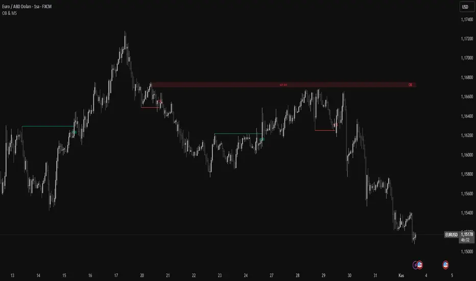
Cumulative Volume Profile DeltaThis indicator calculates the Cumulative Volume Profile Delta (CVPD). It constructs a high-resolution volume profile for each bar using intra-bar data, then derives and accumulates the delta from that profile to show net buying/selling pressure.
Key Features:
Statistical Volume Profile Engine: For each bar, the indicator builds a high-resolution volume profile on a lower 'Intra-Bar Timeframe'. Instead of simple tick counting, it uses statistical models ('PDF' allocation) to distribute volume across price levels and advanced classifiers ('Dynamic' split) to determine the buy/sell pressure before accumulation.
Periodic Accumulation: The CVPD accumulation is anchored to a user-defined 'Anchor Timeframe' (e.g., daily, weekly). This cyclical reset allows to analyze the build-up of pressure within specific trading periods.
"Delta Candle" Visualization: The periodic CVPD is shown as a candle, where:
Open: The CVPD value at the start of the period (or zero).
High/Low: Represent the peak buying (CVD High) and selling (CVD Low) pressure within that period's profile.
Close: The final net delta value (CVD) for the period.
Dual CVD & Divergence Engine: The indicator calculates two CVPDs: a Periodic one (for plotting) and a Continuous one (non-resetting). The continuous line is used as a stable source for the built-in divergence engine (detecting Regular, Hidden, and Exaggerated).
Dynamic Divergence Plotting: Divergence markers are plotted relative to the periodic (candle) CVPD. They automatically adjust their vertical position after a reset to remain visually aligned with the plotted candles.
Note on Confirmation (Lag): Divergence signals rely on a pivot confirmation method to ensure they do not repaint.
The Start of a- divergence is only detected after the confirming pivot is fully formed (a delay based on Pivot Right Bars).
The End of a divergence is detected either instantly (if the signal is invalidated by price action) or with a delay (when a new, non-divergent pivot is confirmed).
Multi-Timeframe (MTF) Capability:
MTF Output: The entire analysis (Delta Candles, Divergences) can be calculated on a higher timeframe (using the Timeframe input), with standard options to handle gaps (Fill Gaps) and prevent repainting (Wait for...).
Limitation: The Divergence detection engine (pivDiv) is disabled if a Higher Timeframe (HTF) is selected.
Integrated Alerts: Includes 18 comprehensive alerts for:
The start and end of all 6 divergence types.
The periodic CVPD crossing the zero line.
Conditions of agreement or disagreement between the delta and the main bar's direction.
Caution: Real-Time Data Behavior (Intra-Bar Repainting) This indicator uses high-resolution intra-bar data. As a result, the values on the current, unclosed bar (the real-time bar) will update dynamically as new intra-bar data arrives. This behavior is normal and necessary for this type of analysis. Signals should only be considered final after the main chart bar has closed.
DISCLAIMER
For Informational/Educational Use Only: This indicator is provided for informational and educational purposes only. It does not constitute financial, investment, or trading advice, nor is it a recommendation to buy or sell any asset.
Use at Your Own Risk: All trading decisions you make based on the information or signals generated by this indicator are made solely at your own risk.
No Guarantee of Performance: Past performance is not an indicator of future results. The author makes no guarantee regarding the accuracy of the signals or future profitability.
No Liability: The author shall not be held liable for any financial losses or damages incurred directly or indirectly from the use of this indicator.
Signals Are Not Recommendations: The alerts and visual signals (e.Example: crossovers) generated by this tool are not direct recommendations to buy or sell. They are technical observations for your own analysis and consideration.
Volume-Price Shift Box (Lite Version)Description
This indicator is a clean and intuitive visual tool designed to help traders quickly assess the current balance of bullish and bearish forces in the market.
It combines volume, price movement, VWAP, and OBV dynamics into a compact on-chart table that updates in real time.
This version focuses on the core logic and visualization of momentum and volume shifts, making it ideal for traders who want actionable insight without complex configuration.
How It Works
The script measures the combined strength of multiple market components:
VWAP trend indicates price bias relative to fair value.
OBV (On-Balance Volume) tracks volume flow to confirm or contradict price movement.
Volume ratio compares current volume to its recent average.
Momentum evaluates directional price movement over a configurable lookback period.
Accumulation / Distribution (A/D) Line estimates buying or selling pressure within each candle:
↑ — A/D is rising (buying pressure is increasing)
↑↑ — A/D is rising faster than before (acceleration of buying)
↓ — A/D is falling (selling pressure is increasing)
↓↓ — A/D is falling faster than before (acceleration of selling)
Each of these components contributes to an overall shift score.
Depending on this score, the box displays:
🟢 Bullish Shift — strong upward alignment
🔴 Bearish Shift — downward alignment
⚪ Neutral — mixed or indecisive conditions
Key Features
Compact on-chart information box with color-coded parameters
Combined volume-price relationship model
Configurable lookback and sensitivity controls
Real-time shift strength and trend duration tracking
Adjustable EMA/SMA smoothing for all averages
Lightweight design optimized for clarity
Inputs Overview
Box Position / Size – Place and scale the on-chart info box
Lookback Period – Number of bars used for calculations
VWAP Lookback – Period for VWAP distance smoothing
Shift Sensitivity – Adjusts reaction strength of bullish/bearish shifts
Neutral Zone Threshold – Defines when the market is considered neutral
EMA or SMA – Choose exponential or simple moving averages
Component Weights – Set the influence of VWAP, OBV, Volume, and Momentum on the shift score
Display Toggles – Enable or disable metrics shown in the box (Strength, Volume, VWAP, Duration, OBV)
How to Use
Apply the indicator to any symbol and timeframe.
Observe the box on the chart — it updates dynamically.
Look for transitions between Neutral → Bullish or Neutral → Bearish shifts.
Combine with your existing price action or confirmation tools (e.g., support/resistance, trendlines).
Use the “Strength” and “Duration” values to assess consistency and momentum quality.
(This indicator is not a buy/sell signal generator — it is designed as a contextual analysis and confirmation tool.)
How It Helps
Merges several key volume and price metrics into a single view
Highlights transitions in market control between buyers and sellers
Reduces clutter by presenting only relevant context data
Works on any market and timeframe, from scalping to swing trading
⚠️Disclaimer:
This script is provided for educational and informational purposes only. It is not financial advice and should not be considered a recommendation to buy, sell, or hold any financial instrument. Trading involves significant risk of loss and is not suitable for every investor. Users should perform their own due diligence and consult with a licensed financial advisor before making any trading decisions. The author does not guarantee any profits or results from using this script, and assumes no liability for any losses incurred. Use this script at your own risk.
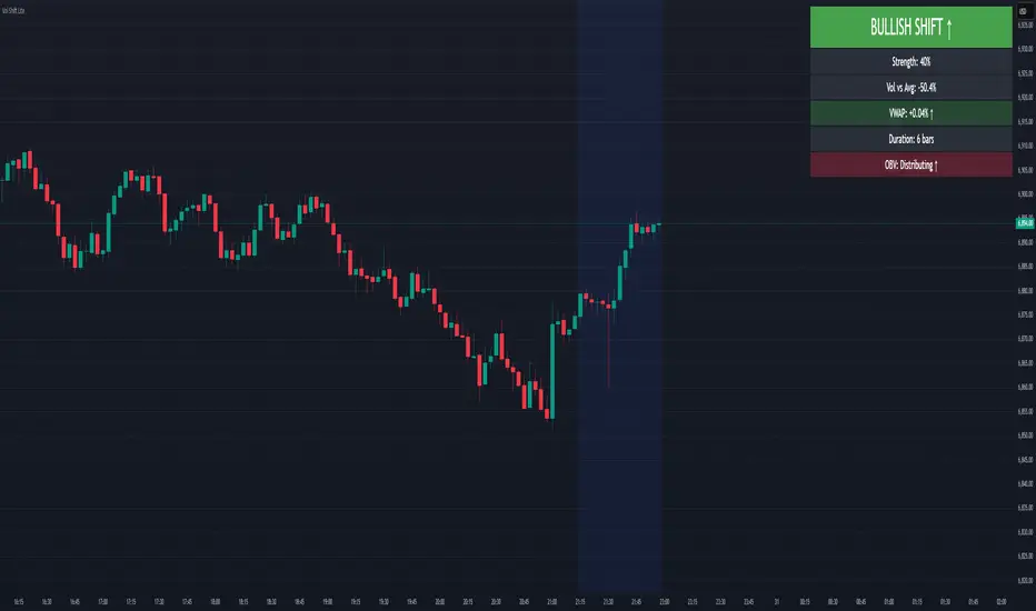
Volume Sentiment Breakout Channels [AlgoAlpha]🟠 OVERVIEW
This tool visualizes breakout zones based on volume sentiment within dynamic price channels . It identifies high-impact consolidation areas, quantifies buy/sell dominance inside those zones, and then displays real-time shifts in sentiment strength. When the market breaks above or below these sentiment-weighted channels, traders can interpret the event as a change in conviction, not just a technical breakout.
🟠 CONCEPTS
The script builds on two layers of logic:
Channel Detection : A volatility-based algorithm locates price compression areas using normalized highs and lows over a defined lookback. These “boxes” mark accumulation or distribution ranges.
Volume Sentiment Profiling : Each channel is internally divided into small bins, where volume is aggregated and signed by candle direction. This produces a granular sentiment map showing which levels are dominated by buyers or sellers.
When a breakout occurs, the script clears the previous box and forms a new one, letting traders visually track transitions between phases of control. The colored gradients and text updates continuously reflect the internal bias—green for net-buying, red for net-selling—so you can see conviction strength at a glance.
🟠 FEATURES
Volume-weighted sentiment map inside each box, with gradient color intensity proportional to participation.
Dynamic text display of current and overall sentiment within each channel.
Real-time trail lines to show active bullish/bearish trend extensions after breakout.
🟠 USAGE
Setup : Add the script to your chart and enable Strong Closes Only if you prefer cleaner breakouts. Use shorter normalization length (e.g., 50–80) for fast markets; longer (100–200) for smoother transitions.
Read Signals : Transparent boxes mark active sentiment channels. Green gradients show buy-side dominance, red shows sell-side. The middle dashed line is the equilibrium of the channel. “▲” appears when price breaks upward, “▼” when it breaks downward.
Understanding Sentiment : The sentiment profile can be used to show the probability of the price moving up or down at respective price levels.
